4 UX Hacks to Increase Online Sales
 (1 votes, average: 5.00 out of 5)
It happens to all of us. We want to make more online sales.
But often times, we’re not ready to roll up our sleeves and do the hard work. Whether it’s your blog, online store, or a landing page, it’s your responsibility to create the best possible experience. In the online world, this is referred to as User Experience, or simply UX.
UX is all about optimising your content and design for the user, not for search engines or your own personal gains.
UX optimisation will help you solve a lot of problems that could be hurting your sales, like usability, interaction design, content strategy, among others. The truth is that a few tweaks here and there on your site can have a huge impact on your conversion rate.
User Experience is a broad topic with many arms. Luckily, you don’t need to completely immerse yourself in UX courses to learn some of the basics and apply them to your site. If you can focus on the 4 hacks below, you’ll be on your way to significantly improving your site’s user experience, and ultimately, increasing conversions and sales.
Let’s get started.
Hack #1: Speed up your page load time
If you don’t generate organic traffic to your site, you shouldn’t bother about page loading time, right?
Wrong.
If you don’t want to lose customers, you must optimise your page and increase its loading time. 25% of buyers will abandon your page if it takes more than 4 seconds to load.
Site speed is important to everybody and a very important part of any website’s user experience. Have you ever visited a page only to click on the back button because you were tired of waiting for the page to fully load?
It’s never a good feeling.
Sadly, snail loading pages are conversion killers. It doesn’t matter how helpful, rich, and persuasive your copy is, if the page can’t load up quickly, you’ll lose sales.
But before you try to increase your page loading speed, you have to know what your current speed is. Since site visitors expect your page to load within 4 seconds, you want to make sure that your load time is below 4 seconds.
Follow these simple steps to find out.
i). First step: Go to PageSpeed Insights or GTmetrix and test the speed of your website.
ii). Analyse your result. Check your page load time to see whether you’ve work to do. Of course, you know that if your load time is more than 4 seconds, you should start improving that.
Digital marketers who understand the impact of page speed and how it can increase sales go the extra mile to invest in improving overall site speed. You can increase your revenue and closed leads by up to 300% by simply increasing your page load time.
Hack #2: Automate the ordering process
There are several questions that your customers need quick answers to. If only you can chest out and provide the answers, you’ll boost sales conversion.
Just having the forms on your e-commerce sites is not enough, especially when there are too many form fields to manually fill. Who has time for that?
If there are objections during a checkout, you’ll need to optimise it. If your analytics data shows you that a lot of buyers abandon the checkout, you can start the optimisation process. One idea to test is automating your form in the ordering process. One idea would be to autofill city and state from user location.
Hack #3: Use more white space
Negative space or white space is so important to web design. “It’s the blank canvas from which every design begins”, says Jon MacDonald.
Wait. Before you read further, don’t mistake white space because of the “white.” It could be any colour provided that it’s blank; free of elements such as images, videos, texts, etc.
Although most people only know the “white” aspect of a whitespace design. Truly, it’s the most popular and I recommend you stick to white for several reasons. White is a cool colour, perfect, complete, and peaceful.
If you want your customers to feel all of these when making purchase decisions, why not use blank white space to design your page.
In today’s competitive digital marketing industry, you need to differentiate your brand in a special way.
Most people who have not studied UX design and optimisation see whitespace as a wasted space in a website. But it’s a myth. White space helps the CTA stand out and irresistible to the right people.
White space isn’t about aesthetics, but it’s a key driver of sales on any page.
The earlier you understand this, the better your conversion rate will be when you eventually allow this powerful concept rule your landing page design.
You need a balance between white spaces and other elements of your page. That way, your customers will understand clearly how to navigate your page when deciding to buy a product.
Here are 5 ways whitespace add extra power to your pages:
- Prominence: When it comes to making purchases, customers usually find it difficult to recall more than one item. White space around the highlighted items tends to increase their prominence.
- Comprehension: One aspect of user experience that you must never neglect is comprehension. Your site users should easily read your post, copy, message, or review and understand it.
- Satisfaction: Several research studies into web page layout revealed that white space, typography, indentation, and figures may not always affect the performance of the page, but that it does influence user’s satisfaction.
- Clarity: This is pretty straightforward. A whitespace adds clarity to your web page. No matter how boring your industry or topic might seem, all you need is to communicate your message clearly.
- Trust: Last but not least, whitespace is responsible for enhancing trust that people have towards you. How true?
Avoid stuffing your site with too many unnecessary elements. Several things that can hurt your users are:
- Small print
- Too much text
- Page clutter
- Little or no white space.
- Misalignment
- No margins
Hack #4: Limit choices and provide the best option
Most marketers think that having too many options will boost conversions, but that’s not always the case.
In today’s competitive market, less is more.
Let’s assume you sell different wristwatch models. On your product pages, you may be tempted to list 2 – 3 different watches and include different buy buttons or CTA.
But don’t give in to that.
In order to convert more leads into customers and in turn increase online sales, start off by recommending one product at a time.
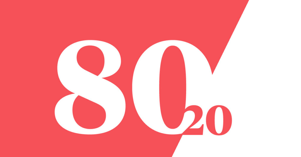
In fact, that’s what the “Pareto Principle” teaches.
The Pareto Principle (also referred to as the 80/20 rule), is an observation that most things in life are not distributed evenly. And when it comes to marketing, there is no form of balance. It’s not 50/50.
So the observation is that 20% of the input creates 80% of the result. Put another way: 20% of the customers create 80% of the revenue.
When you gauge it in the light of landing page optimisation, the Pareto Principle would mean that fewer options will produce more results. For example:
- 1 call-to-action button = 20 sales
- 2 call-to-action buttons = 13 sales
- 3 call-to-action buttons = 5 sales
So when next you’re looking to increase conversions on your campaign’s landing pages, remember the 80/20 rule. It’ll guide you properly.