
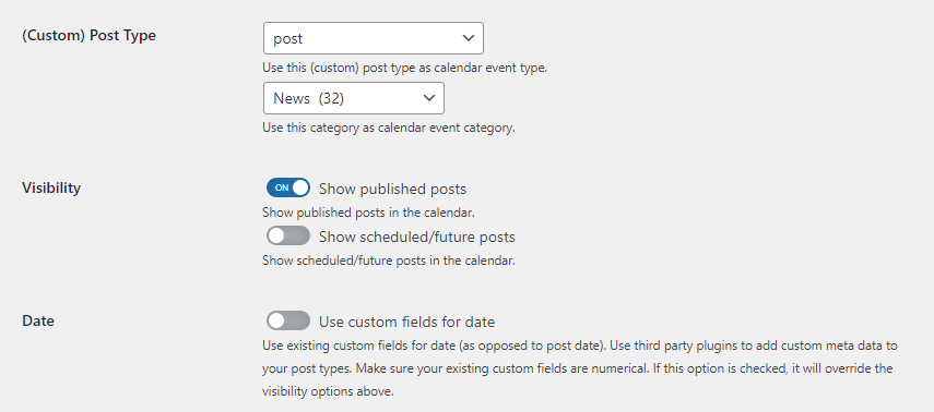
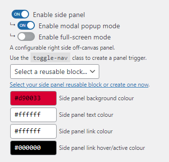
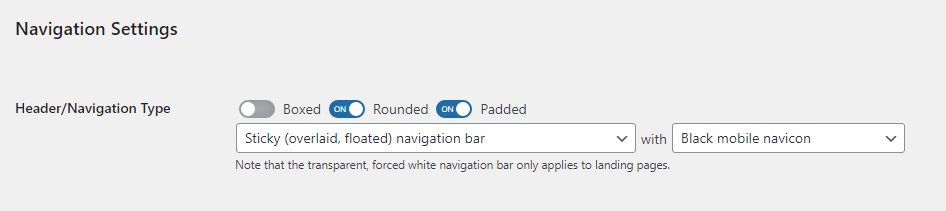
When it comes to WordPress settings and admin panels, I’ve always been a fan of minimalism and default/native styling. I never liked heavy control panels with unnecessary bells and whistles. Recently, though, for one of my clients, I wanted to beautify the control panel by adding toggles instead of checkboxes. They look better, more recognizable and there’s more contrast.
Experimenting with various methods, I decided to avoid modifying the HTML structure by adding unnecessary <span> or hidden <i> elements. I wanted a plug and play solution, a CSS class to do the job. I also wanted to avoid JavaScript.
Also, in the light of the recent WordPress design updates, I used the official blue for the active state.


Solution (CSS)
My solution is 1.19 KB (452 bytes Gzipped) and it uses :after and :before pseudo elements:
/**
 * Checkbox Toggle UI
 */
input[type="checkbox"].wppd-ui-toggle {
    -webkit-appearance: none;
    -moz-appearance: none;
    appearance: none;

    -webkit-tap-highlight-color: transparent;

    width: auto;
    height: auto;
    vertical-align: middle;
    position: relative;
    border: 0;
    outline: 0;
    cursor: pointer;
    margin: 0 4px;
    background: none;
    box-shadow: none;
}
input[type="checkbox"].wppd-ui-toggle:focus {
    box-shadow: none;
}
input[type="checkbox"].wppd-ui-toggle:after {
    content: '';
    font-size: 8px;
    font-weight: 400;
    line-height: 18px;
    text-indent: -14px;
    color: #ffffff;
    width: 36px;
    height: 18px;
    display: inline-block;
    background-color: #a7aaad;
    border-radius: 72px;
    box-shadow: 0 0 12px rgb(0 0 0 / 15%) inset;
}
input[type="checkbox"].wppd-ui-toggle:before {
    content: '';
    width: 14px;
    height: 14px;
    display: block;
    position: absolute;
    top: 2px;
    left: 2px;
    margin: 0;
    border-radius: 50%;
    background-color: #ffffff;
}
input[type="checkbox"].wppd-ui-toggle:checked:before {
    left: 20px;
    margin: 0;
    background-color: #ffffff;
}
input[type="checkbox"].wppd-ui-toggle,
input[type="checkbox"].wppd-ui-toggle:before,
input[type="checkbox"].wppd-ui-toggle:after,
input[type="checkbox"].wppd-ui-toggle:checked:before,
input[type="checkbox"].wppd-ui-toggle:checked:after {
    transition: ease .15s;
}
input[type="checkbox"].wppd-ui-toggle:checked:after {
    content: 'ON';
    background-color: #2271b1;
}
If you need an international version, just remove the content: 'ON'; property, or replace it with another word or a tick symbol ✓.
Solution (HTML)
The only change you need to make to your checkboxes is adding a class – class="wppd-ui-toggle" – make sure you replace the prefix or use something related to your plugin. See example below:
<input type="checkbox" class="wppd-ui-toggle" id="field-id" name="field_name" value="1" <?php echo ((int) get_option('field_name') === 1) ? 'checked' : ''; ?>>
<label for="field-id">Enable this option</label>
Notes
You are not restricted to use the official blue. You can replace the blue with any other official colour, or even a colour of your own, if you need to keep a specific colour pallete for branding purposes.
