Part of the CSS-Only Techniques guide.
I believe the “why” in the title is self-explanatory. If not, it’s all about performance. Over the past decade, I switched from WOFF to WOFF2, then to variable fonts, and now I’m back full-circle to a performance-enhanced system font stack.
I love variable fonts. For a long time, I’ve used Alliance 1, from Degarism Studio. I’ve also used Google Fonts and Bunny Fonts, and also locally-hosted custom fonts. I always tinkered with the fonts sizes, weights, line heights and more. A clean typography is very important for me.
In web development, there are always compromises to be made. As my website is built on WordPress, the speed has gone down in the past years. Google has also been acting up, SEO-wise.
So, in order to speed up my website, reduce the external requests and improve my Core Web Vitals, I removed all custom fonts.
System fonts are nothing new. In fact, Medium was using them in 2015. They feel just like your OS because they are using native fonts. Many modern operating systems choose fonts very wisely, and all have a very sleek look and feel to them. It’s not like defaulting back to a web-safe font of Arial or Times New Roman. Trust me; nobody wants to see Times New Roman on a website, unless it’s heavily optimized. System fonts can be a great alternative to web fonts and web-safe fonts. I really like the look of my font, and now I know it’s not causing any load for users. Even though Google Fonts can be hosted locally, it’s still part of the overall page weight.
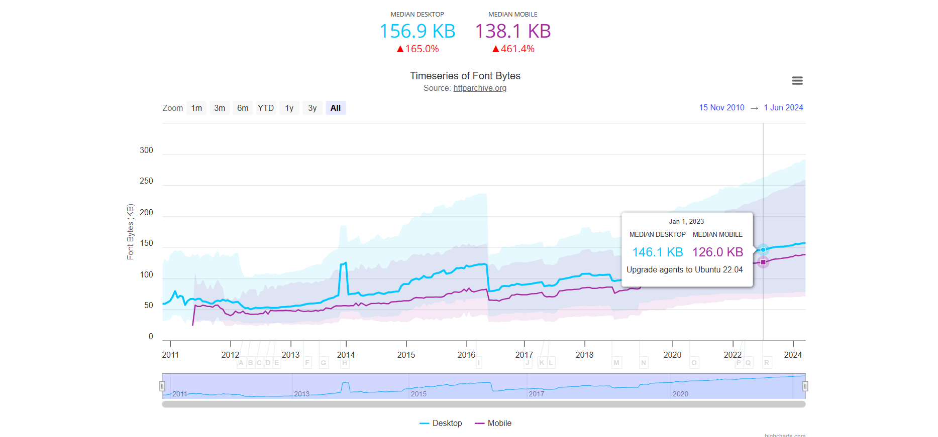
And best of all, system fonts work just like web-safe fonts, in that they don’t require any download time by the browser. This can help reduce the overall page weight on your website. As of July 2024, web fonts, on average, account for around 16% of a total website’s weight. While this is not really bad, remember that every little optimization you make adds to a speedy website, especially on mobile.
Read this, if you’re into typography:
What Medium is doing is a bit overkill. I believe a balanced system font stack + ligatures + typography CSS settings go a long way. I wrote about this before, when I built an enhanced CSS stack for, guess what, Times New Roman! I am happy with how it looks on Windows and mobile devices.

Anyway, back to our matter in hand, the system font stack. Here is my current font stack, using CSS variables:
:root {
    --font-family: -apple-system, BlinkMacSystemFont, 'Segoe UI Variable Text', "Segoe UI", Roboto, Helvetica, 'Helvetica Neue', "Oxygen", "Ubuntu", "Cantarell", "Fira Sans", "Droid Sans", Arial, system-ui, sans-serif, "Apple Color Emoji", "Twemoji Mozilla", "Segoe UI Emoji", "Android Emoji";
    --font-heading: -apple-system, BlinkMacSystemFont, 'Segoe UI Variable Heading', "Segoe UI", Roboto, Helvetica, 'Helvetica Neue', "Oxygen", "Ubuntu", "Cantarell", "Fira Sans", "Droid Sans", Arial, system-ui, sans-serif, "Apple Color Emoji", "Twemoji Mozilla", "Segoe UI Emoji", "Android Emoji";

    --font-monospace: ui-monospace, "SFMono-Regular", "SF Mono", Menlo, Consolas, "Liberation Mono", monospace;
}

body {
    font-family: var(--font-family);
    font-variant-ligatures: discretionary-ligatures;

    font-weight: 400;
    font-style: normal;
    font-size: 16px;

    line-height: 1.6;
}
h1, h2, h3, h4, h5, h6 {
    font-family: var(--font-heading);
    font-weight: 500;

    text-wrap: pretty;
}
Notice system-ui comes before the emoji fonts, which is fine. Regular letters will use system-ui as the fallback if none of the other fonts are available, and emoji characters will still correctly use the emoji fonts.
Purpose of emoji fonts: They only get used when a character in your text requires an emoji glyph. Regular letters will never trigger the emoji font.
Priority order: Font stacks are read left to right. Browsers pick the first font that has the character. If you put emoji fonts earlier, the browser might try to render normal text using an emoji font (rare, but can happen with some glyphs).
Common pattern: Most system font stacks put emoji fonts after the main text fonts, so they only “kick in” when needed.
Let’s break it down.
I am defining 2 font families, one for the body content, and one for headings. The reason for this is that I want to use the “Segoe UI Variable Text” font for the body, and the “Segoe UI Variable Heading” font for headings.
Windows 11 introduced a new system font called Segoe UI Variable. This new font is a variable font that replaces the older Segoe UI font in Windows 10 and below.
Many sites use the system font when rendering sans-serif text, since it’s quick to load (already installed in your device) and looks like other apps on your device.
You can read the technical details and why using this new font is a bit tricky here. If you like it, but you don’t have Windows 11, use a CDN.
I then use the CSS variables inside the body and h1, h2, h3, h4, h5, h6 elements. I might want to use a different font for headings in the future, such as a serif variant.
Note that font-variant-ligatures: discretionary-ligatures; does not work with letter-spacing.
What I would like to do next is to have a JavaScript library that implements some “typography tweaks”. See Medium’s “Typography is for everyone” article above. Also see this breakdown of various spaces and widths. The same goes for em-dashes, en-dashes, quotes and so on.

[…] default font options in the font family selector are all web safe fonts by default, and that is awesome. But what if you wanted to add more fonts to the selector? Maybe Google Fonts or custom fonts […]