What happens when WordPress plugins reach maturity?
- A plugin reaches maturity when no more features can be added or make sense to be added.
- A plugin reaches maturity when it works with any other plugin or theme combination, with zero conflicts.
- A plugin reaches maturity when bug reports, support tickets and feature requests dry up, but sales are going strong.
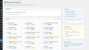
At this moment, and I’m talking strictly from a code/design point of view, it’s time for micro-optimizations. User interface tweaks, user experience upgrade, improved contextual help, performance optimization and more. Now, plugins are constrained by WordPress’ back-end appearance. If you want a plugin to look native and integrated, you use the native tabs, buttons, form tables, and form fields. You can also go overboard and add your own styling and CSS libraries.
My opinion is that there should be a balance between existing appearance and new styles. While I agree with toggles and switches instead of checkboxes, different colours or a different HTML structure, I don’t agree with custom fonts (either mismatched or conflicting with native fonts), JavaScript tabs and a completely different (and confusing) settings panel structure.
As you can tell, I am talking about the back-end settings panels and meta boxes. All custom styles and elements should complement native styles. For example, I use custom fonts only for my settings panel, I use a more vivid blue for checkboxes, different font sizes and weights for titles and section headings, and I also use card, grids, and badges.
The CSS I add to a plugin is minimal. I tend to use various shades and tints of the official WordPress colours. If none of these make sense for my plugin or theme back-end, I use a predefined colour scheme, or I generate my own colour shades/tints set. Flat UI colours are usually my go-to inspiration.
Why am I doing this? Because, as a plugin developer, screenshots sell my plugins. And some of my plugins are exclusively back-end. I want the administrator to fall in love with the plugin at first sight. And then, to follow through, I want them to have an excellent relationship with all the options, panels, and settings I am providing.
If you are using any of my WordPress plugins, you will notice a few design-oriented updates during the next few months.
Here are some trends I see going strong this year, mostly for screenshot-heavy websites. Have you heard of the Linear look?
There’s one style that seems to be taking over the tech SaaS world, and it’s the one popularized by Linear’s homepage.
Dozens of sites have put their own spin on it, and now it’s a certified trend.
Frontend Horse
And there’s more where that came from. Here’s a non-exhaustive links of websites using similar designs:
- Linear
- Vercel Design
- Maybe
- Apple Design (not an Apple fan, but their typography — choice of fonts, line height, spacing — is on point)
- Raycast
- Monopo London
- Evervault
- Railway
- Anron Pro
- Texts
- Whop
- Supabase
- Raycast
- Terzo AI
- Gitness
- GitBook
- Particl
- Resend
- AuthKit
- Featurebase
As a UI designer, I cannot overlook them, and, as a plugin developer, I want to bring some of that design to the WordPress back-end, in a discrete, non-intrusive way.
Keep an eye on my plugins to see if I succeed in my quest 😃


