FX Builder for ClassicPress
A simple page builder plugin.
The one you can actually use.
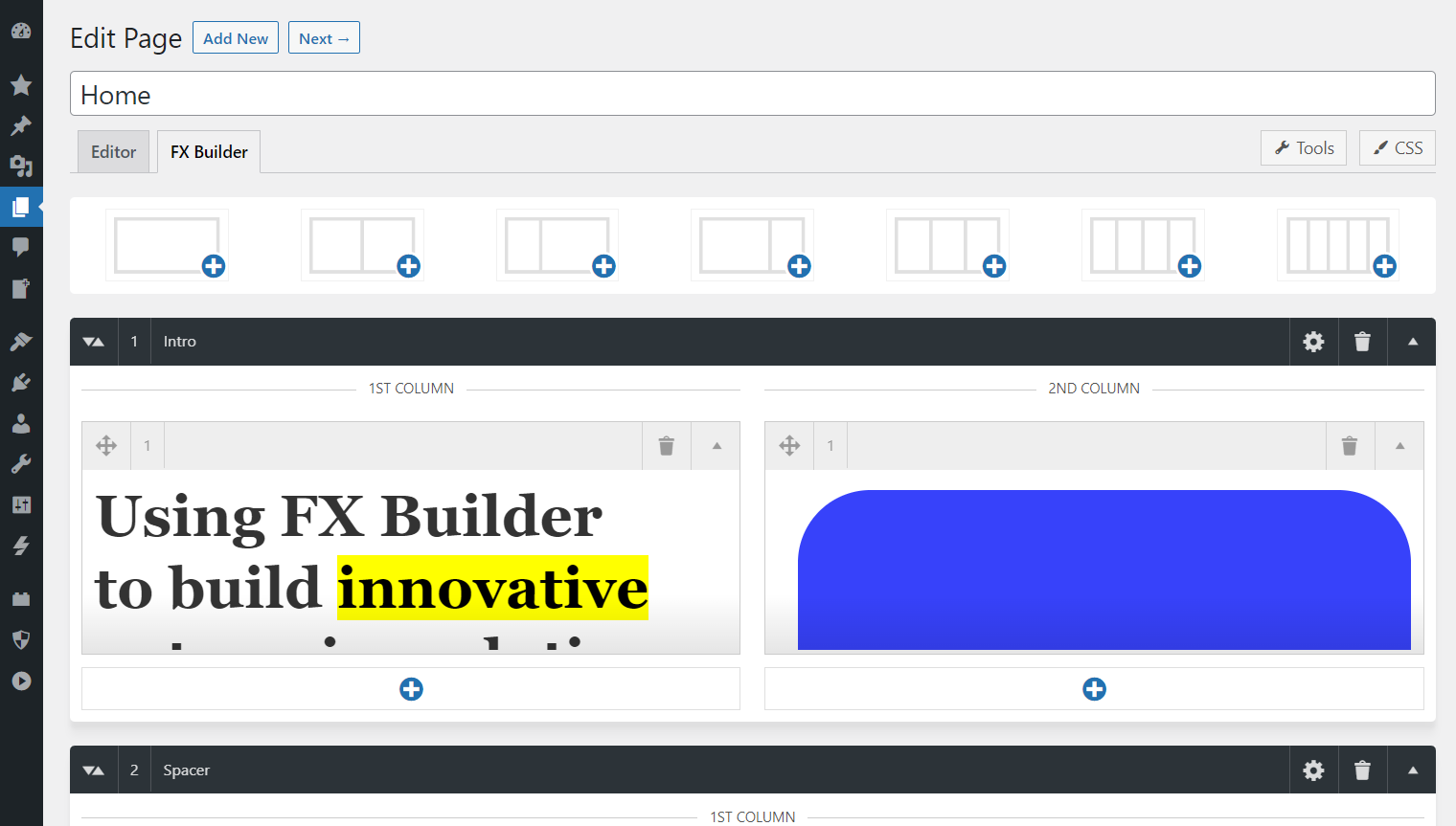
Use FX Builder to build innovative enterprise solutions.
FX Builder is an improved page builder plugin for ClassicPress that provides visual columns in the post editor without using shortcodes. From the setting page, you can enable it for posts, pages, and custom post types. There is no vendor lock-in. If you decide you no longer wish to use the plugin, you can disable it without losing your content (though you would lose the column formatting).
Formerly known as f(x) builder. Forked and improved.

Features
- Super simple to use.
- Visual columns in the post editor.
- If you disable the plugin, your content is not lost.
- Settings to enable/disable for each post type.
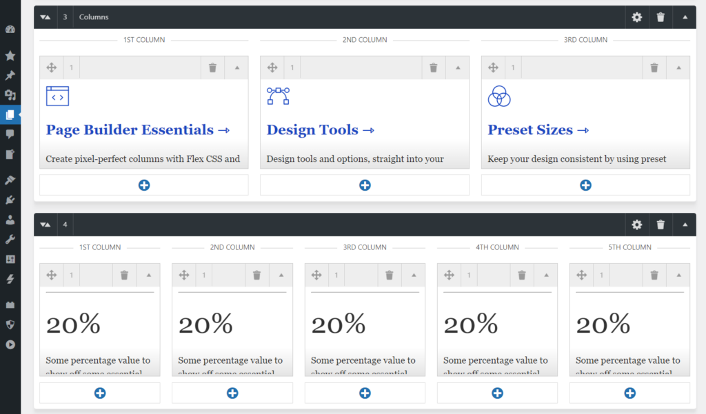
- 1–5 columns supported.
- Custom Google fonts or Bunny Fonts.
- Free, open source, GPL v3.0 or later licence.
GitHub
You can contribute to development on GitHub –
https://github.com/wolffe/fx-builder
Frequently Asked Questions
Installation Instructions
- Navigate to Plugins → Add New Page from your ClassicPress Dashboard.
- To install from plugin .zip file, click “Upload Plugin” button in Plugins → Add New screen. Browse the plugin .zip file, and click the “Install Now” button.
- Activate the plugin.
- Navigate to FX Builder to configure.
- Edit your content.
Screenshots
Changelog
Changelog
= 1.6.0 =
* Switch front-end layout from Flexbox to CSS Grid for more reliable column sizing and no 50% wrap issues
* Add Design tab with Responsive Breakpoints (Small/Medium/Large), range sliders, and linked behavior so Small < Medium < Large
* Add "Frequently used widths" reference list (480, 768, 1024, 1280, 1920 px) in Design tab
* Add FX Builder column to post list screen (Posts, Pages, and other supported post types) to show which items use FX Builder
* Add Update URI plugin header for ClassicPress and custom updaters
* Normalize update API response: set requires_cp from requires when missing for ClassicPress compatibility
* Fix Tools and Custom CSS modals: Cancel button now closes the modal

= 1.5.1 =
* Fix fonts being enqueued even when no fonts are selected
* Fix row and column dragging issues with Sortable.js (invalid selector error)
* Add overflow: hidden to fixed height rows to prevent content overflow
* Add Cancel button to Edit Content and Row Settings modals for better user control
* Enqueue Akar icons in admin interface

= 1.5.0 =
* Fix modal content scrolling when settings exceed modal height
* Remove jQuery dependency (replace with vanilla JavaScript for better performance)
* Add new Cover shortcode for creating hero sections with background images, overlays, and customizable styling
* Add new Buttons shortcode for creating styled button groups with customizable colors, borders, and alignment
* Add row background color setting in Row Settings modal
* Add column padding setting in Row Settings modal (useful for boxed content)
* Add contextual help tooltips for all Row Settings fields
* Change modal close button text from "Apply" to "Close" for better clarity
* Remove redundant content processing
* Update JavaScript to modern syntax and best practices 1.4.4 =
* Fix compatibility issue with PHP 8.5 (props @xxsimoxx)

= 1.4.3 =
* Add section duplication feature
* Improve outer section inserter
* Remove rogue console.log

= 1.4.2 =
* Fix undefined array key "row_html_height_unit"
* Fix SCF/ACF outline overlapping the FX column wrapper
* Convert FX switcher to vanilla JavaScript

= 1.4.1 =
* Fix bottom column selector being displayed as block instead of Flex

= 1.4.0 =
* Fix unescaped variable
* Fix typo in readme.txt
* Add new Settings and Typography options panel
* Add Google fonts and Bunny fonts functionality to TinyMCE's `fontformats` array
* Add translatable strings to the Settings page
* Add admin stylesheet
* Update readme.md with helpful links and a short description
* Update ZIP release workflow
* Switch more elements from floats to Flex CSS
* Replace deprecated "resize" function with "resize" event
* Clean up old settings panel (alpha)
* Remove unused filter
* Remove tabbing capability in textarea element

= 1.3.1 =
* Add line height controls
* Add column vertical alignment
* Add 5-column layout
* Add section height controls to create spacers
* Various UI improvements

= 1.3.0 =
* Remove jQuery UI Sortable dependency and replace with SortableJS
* Remove old, unused files
* Update plugin branding to be consistent with "FX Builder"

= 1.2.3 =
* Fix author link
* Add system fonts to TinyMCE

= 1.2.2 =
* Fix undefined variable
* Add image styling to wraps to make sure images are not wider than content
* Remove "Wide" content width, as it's not relevant, and can be added as a class

= 1.2.1 =
* Add font size presets, custom font size and font weigh to TinyMCE
* Clean up row and item templates
* Clean up front-end styles
* Clean up readme.txt

= 1.2.0 =
* First public release for ClassicPress
* Make sure the plugin is fully compatible with ClassicPress 2.1+
* Make sure the plugin is fully compatible with PHP 8+
* Change all legacy CSS (floats) with Flex CSS

= 1.0.2 =
* Last version before forking
Installation and Usage
Installation
- Download the Plugin
- Download FX Builder from the ClassicPress plugin repository.
- Upload to ClassicPress
- Navigate to Plugins → Add New → Upload Plugin
- Select the downloaded ZIP file
- Click Install Now and then Activate
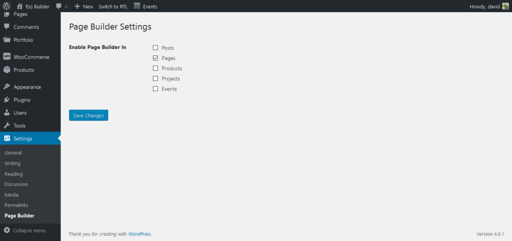
- Enable for Post Types
- Go to FX Builder → Settings
- Check the post types where you want to enable FX Builder (Posts, Pages, or custom post types)
- Click Save Changes
Basic Usage
- Enable FX Builder for a Post/Page
- Edit any post or page where FX Builder is enabled
- You’ll see an FX Builder toggle switch above the content editor
- Toggle it ON to activate FX Builder for that post
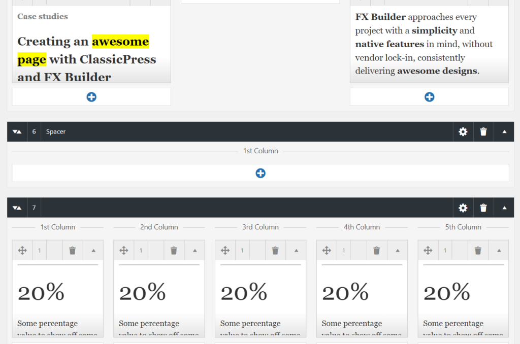
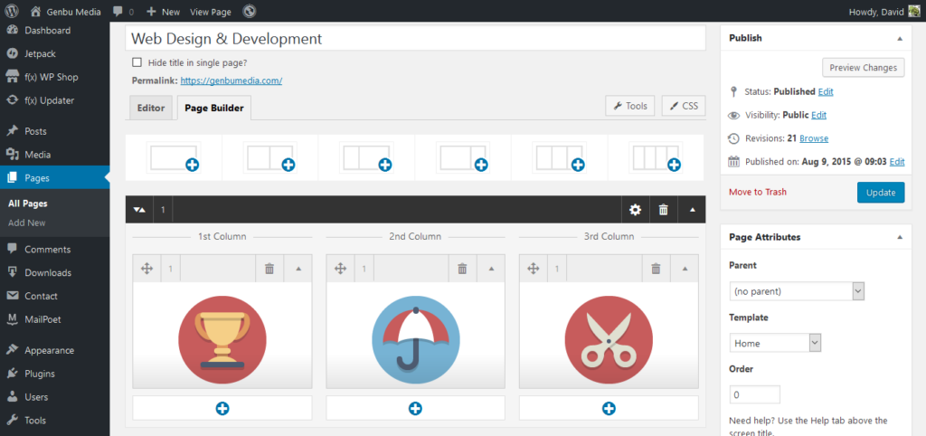
- Add Rows
- Click the Add Row button
- Choose a layout (1 column, 2 columns, 3 columns, etc.)
- A new row will appear in the builder
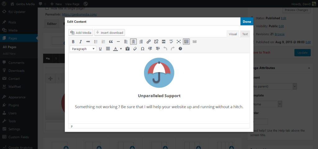
- Add Content to Columns
- Click Add Item in any column
- A modal editor will open where you can add your content
- Use the visual editor (TinyMCE) to format your text, add links, images, etc.
- Click Close when done
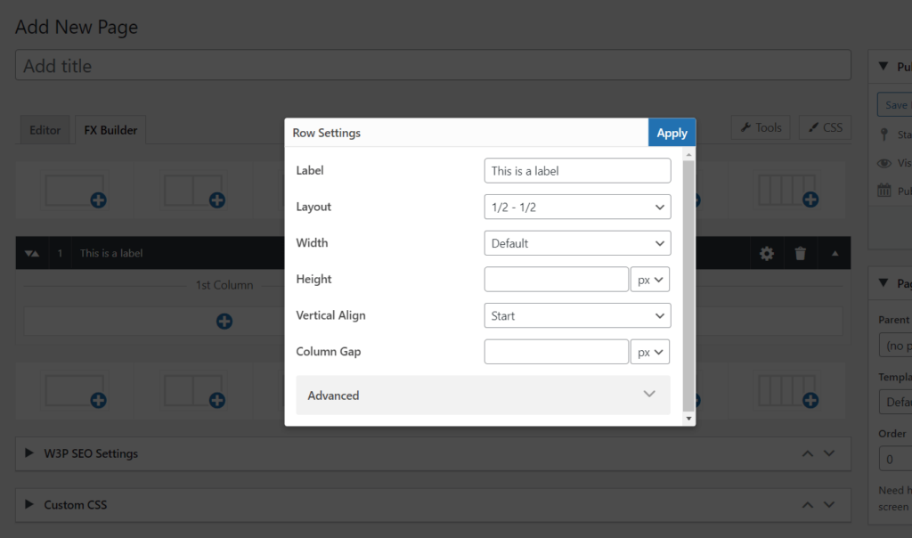
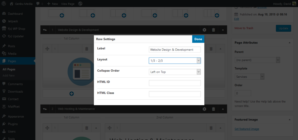
- Configure Row Settings
- Click the row title or settings icon
- Configure options like:
- Label: Admin-only label for your reference
- Layout: Change column layout
- Width: Default or Fullwidth
- Background Color: Set a background color for the row
- Column Padding: Add padding inside columns
- ID/Classes: Add custom HTML attributes
- Click Close to save
- Reorder and Manage
- Drag rows up/down to reorder them
- Drag items between columns to move content
- Use the duplicate, delete, and other action buttons as needed
- Save Your Work
- Click Update or Publish as you normally would
- FX Builder content is automatically saved with your post
How It Works Internally
Data Storage
FX Builder stores all content in post meta fields, not in the main post content. This allows for flexible column layouts without cluttering the database.
Post Meta Keys
_fxb_active
- Stores whether FX Builder is active for this post
- Value:
"1"if active,nullif inactive
_fxb_row_ids
- Comma-separated list of row IDs
- Row IDs are timestamps created when the row is added
_fxb_rows
- Multi-dimensional array containing all row data
- Structure:
_fxb_rows = [
    {row_id} => [
        'id'                  => timestamp when row was created
        'index'               => row order index
        'state'               => 'open' or 'close'
        'col_num'             => number of columns (1-5)
        'layout'              => layout setting (e.g., '12_12' for 1/2 - 1/2)
        'col_1'               => comma-separated item IDs in column 1
        'col_2'               => comma-separated item IDs in column 2
        'col_3'               => comma-separated item IDs in column 3
        'col_4'               => comma-separated item IDs in column 4
        'col_5'               => comma-separated item IDs in column 5
        'row_title'           => admin label/title
        'row_html_id'         => front-end HTML id attribute
        'row_html_class'      => front-end HTML class attributes
        'row_html_width'      => 'default' or 'fullwidth'
        'row_html_height'     => optional fixed height value
        'row_column_align'    => vertical alignment ('start', 'center', 'end')
        'row_column_gap'      => gap between columns
        'row_bg_color'        => background color (hex)
        'row_col_padding'     => padding inside columns
    ],
    {other_row_id} => ...
]
_fxb_items
- Multi-dimensional array containing all item (content block) data
- Structure:
_fxb_items = [
    {item_id} => [
        'item_id'      => timestamp when item was created
        'item_index'   => order of the item
        'item_state'   => 'open' or 'close'
        'item_type'    => 'text' (currently only one type)
        'row_id'       => ID of the parent row
        'col_index'    => column index (1-5)
        'content'      => the actual content HTML
    ],
    {other_item_id} => ...
]
_fxb_custom_css
- Custom CSS for the specific page/post
- Only loaded on singular pages when FX Builder is active
_fxb_custom_css_disable
- If set to
1, custom CSS is not loaded - Useful for disabling CSS without removing it
_fxb_db_version
- Stores the plugin version for future migration purposes
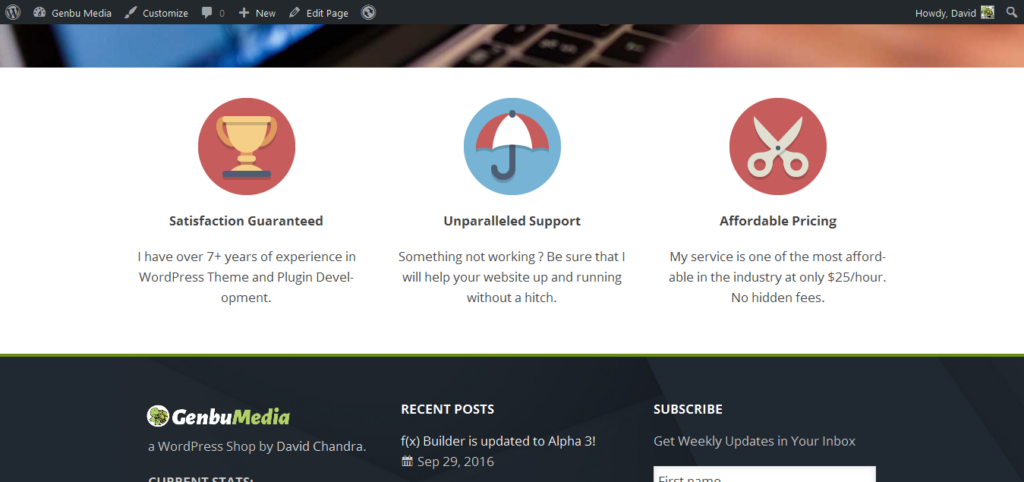
Front-End Rendering
When a post with FX Builder active is displayed:
- The plugin hooks into
the_contentfilter - It retrieves all row and item data from post meta
- It builds HTML structure with proper CSS classes and inline styles
- Content is wrapped in
<div class="fxb-container">with unique ID - Each row becomes a
<div class="fxb-row">with layout classes - Each column becomes a
<div class="fxb-col">with column-specific classes - Each item’s content is rendered inside its column
The rendered HTML uses Flexbox CSS for column layouts, making it responsive and modern.
How the Plugin Works with Content
Content Separation
FX Builder doesn’t use a single content editor. Instead, it creates separate content blocks (items) for each piece of content in each column. This approach provides several benefits:
- Better Organization: Content is logically separated by column
- Easier Editing: Each content block can be edited independently
- Flexible Layouts: Content can be moved between columns easily
- No Shortcode Clutter: The main post content remains clean
TinyMCE Editor Management
When you click Add Item or edit an existing item:
- Modal Editor Opens: A modal window appears with a TinyMCE editor
- Single Editor Instance: FX Builder uses one shared TinyMCE editor (
fxb_editor) - Content Loading: When you click to edit an item:
- The item’s content is loaded into the shared editor
- The editor switches to Visual mode automatically
- You can edit using the full TinyMCE toolbar
- Content Saving: When you close the modal:
- The editor content is saved to that specific item’s data
- The editor is cleared for the next use
- The item’s preview is updated in the column
Why Not Multiple Editors?
FX Builder uses a single shared editor instead of multiple TinyMCE instances because:
- Performance: Multiple TinyMCE instances consume significant memory and CPU
- Simplicity: One editor is easier to manage and maintain
- User Experience: Users focus on one piece of content at a time
- Compatibility: Reduces conflicts with other plugins and themes
Content Processing
- Input: Content is entered/edited in the TinyMCE visual editor
- Sanitization: Content is sanitized using
wp_kses_post()to ensure security - Storage: Sanitized content is stored in the item’s
contentfield in_fxb_itemsmeta - Output: On the front-end, content is processed with
wpautop()for paragraph formatting - Rendering: Final HTML is output within the proper column structure
Content Flow Example
User clicks "Add Item" in Column 1
    ↓
Modal opens with TinyMCE editor
    ↓
User types: "Hello World"
    ↓
User clicks "Close"
    ↓
Content saved to: _fxb_items[{item_id}]['content'] = "Hello World"
    ↓
Item preview updated in Column 1
    ↓
On front-end: Content rendered as <p>Hello World</p> inside Column 1
Shortcode Examples
FX Builder includes two powerful shortcodes for creating hero sections and call-to-action buttons.
Cover Shortcode
The [cover] shortcode creates a hero section with background images, overlays, and customizable styling.
Parameters
image: Background image URL (optional)overlay: Overlay opacity from 0 to 1 (default:0.5)overlay-color: Overlay colour in hex format (default:#000000)text-color: Text colour in hex format (default:#ffffff)padding: Inner padding, e.g.,2em,3rem 2rem(default:2em)height: Height value orauto(default:auto)min-height: Minimum height, e.g.,300px,60vh(default:300px)align: Text alignment:left,center, orright(default:center)valign: Vertical alignment:top,center, orbottom(default:center)fullscreen: Use fullwidth behaviour:0or1(default:0)
Example 1: Cover with Background Image
[cover image="https://example.com/hero-image.jpg" overlay="0.4" overlay-color="#1a1a1a" text-color="#ffffff" min-height="60vh" valign="center" align="center" padding="3rem 2rem"]
<h2>Welcome to Our Website</h2>
<p>This is a hero section with a background image and overlay.</p>
    [buttons align="center"]
        [button link="/contact" bg-color="#ffffff" text-color="#111111" border-radius="3px"]Contact Us[/button]
        [button link="/about" bg-color="transparent" text-color="#ffffff" border="2px solid white" border-radius="3px"]Learn More[/button]
    [/buttons]
[/cover]
Example 2: Solid Colour Cover (No Image)
[cover overlay="0" overlay-color="#0066cc" text-color="#ffffff" min-height="400px" valign="center" align="left" padding="4rem"]
    <h1>Solid Color Hero</h1>
    <p>This cover uses a solid background color instead of an image.</p>
    <p>Perfect for simple, clean designs.</p>
[/cover]
Example 3: Full-screen Cover
[cover fullscreen="1" image="https://example.com/full-width-hero.jpg" overlay="0.5" min-height="80vh" valign="center" align="center"]
    <h1>Fullscreen Hero</h1>
    <p>This cover spans the full width of the viewport.</p>
[/cover]
Example 4: Minimal Cover with Custom Styling
[cover overlay-color="#333333" overlay="0.7" text-color="#f0f0f0" min-height="50vh" padding="2rem" align="left"]
    <h2>Simple and Clean</h2>
    <p>Minimal design with subtle overlay.</p>
[/cover]
Buttons Shortcode
The [buttons] shortcode creates a container for button groups, and [button] creates individual styled buttons.
[[buttons]] Parameters
align: Button alignment:left,center, orright(default:left)id: Optional HTMLidattributeclass: Optional additional CSS classes
[[button]] Parameters
link: Button URL (required)target: Link target:_self,_blank,_parent, or_top(default:_self)bg-color: Background colour in hex format (default:#111111)text-color: Text colour in hex format (default:#ffffff)border-radius: Border radius, e.g.,3px,50%,1em(default:0)border: Border style, e.g.,2px solid green,1px dotted #fff
Example 1: Simple Button Group
[buttons align="center"]
    [button link="/shop" bg-color="#0066cc" text-color="#ffffff" border-radius="5px"]Shop Now[/button]
    [button link="/contact" bg-color="#333333" text-color="#ffffff" border-radius="5px"]Contact Us[/button]
[/buttons]
Example 2: Buttons with Borders and Custom Styling
[buttons align="center"]
    [button link="/signup" bg-color="transparent" text-color="#0066cc" border="2px solid #0066cc" border-radius="25px"]Sign Up[/button]
    [button link="/login" bg-color="#0066cc" text-color="#ffffff" border-radius="25px"]Log In[/button]
[/buttons]
Example 3: Left-Aligned Buttons with IDs
[buttons align="left" id="cta-buttons" class="hero-ctas"]
    [button link="/download" bg-color="#28a745" text-color="#ffffff" border-radius="3px"]Download[/button]
    [button link="/docs" bg-color="#6c757d" text-color="#ffffff" border-radius="3px"]Documentation[/button]
[/buttons]
Example 4: Buttons Inside Cover
[cover image="https://example.com/hero.jpg" overlay="0.5" min-height="500px" valign="center" align="center"]
    <h1>Get Started Today</h1>
    <p>Join thousands of satisfied customers.</p>
    [buttons align="center"]
        [button link="/pricing" bg-color="#ff6b6b" text-color="#ffffff" border-radius="50px"]View Pricing[/button]
        [button link="/demo" bg-color="transparent" text-color="#ffffff" border="2px solid #ffffff" border-radius="50px"]Watch Demo[/button]
    [/buttons]
[/cover]
Example 5: External Link Button
[buttons align="right"]
    [button link="https://example.com" target="_blank" bg-color="#007bff" text-color="#ffffff" border-radius="4px"]Visit External Site[/button]
[/buttons]
Tips for Using Shortcodes
- Nesting: You can nest
[buttons]inside[cover]for complete hero sections - Styling: Use
bg-color="transparent"with borders for outline-style buttons - Responsive: Buttons automatically wrap on smaller screens
- Hover Effects: Buttons have automatic hover effects (brightness increase)
- Accessibility: Always provide meaningful link text inside
[button]tags
Disable Front-End CSS
If you want to use your own CSS, you can disable FX Builder’s front-end styles:
add_filter( 'fx_builder_css', '__return_false' );Manual Post Type Support
To manually add FX Builder support to a custom post type:
add_action( 'init', function() {
    add_post_type_support( 'your_post_type', 'fx_builder' );
} );
FX Builder 1.6.0 Release Notes
Overview
Version 1.6.0 adds a CSS Grid layout system, a Design tab with configurable Responsive Breakpoints, an FX Builder column on post list screens, and several compatibility and UX improvements. The front-end no longer uses Flexbox for the main grid; each row is a Grid container whose columns are defined by template rules. Breakpoints are configurable from FX Builder → Design → Responsive Breakpoints, with no hardcoded pixel values in the stylesheet.
How the Grid System Works
The Grid Container
Every FX Builder row uses a single grid container: the inner wrapper (.fxb-row > .fxb-wrap) that holds the columns. That wrapper has:
display: grid— so all direct children (the columns) participate in the grid.gap— spacing between columns (and rows when they wrap). The value comes from your row settings (e.g. “Column gap”) and falls back to2emviavar(--fxb-template-gap, 2em).
Columns don’t have fixed widths anymore. Their size is determined entirely by grid-template-columns on the container.
Layout Templates
Each row layout (full width, ½–½, ⅓–⅔, etc.) is implemented as a grid template: a list of column track sizes. FX Builder uses the fr unit so columns share space in proportion without percentage or flex hacks.
| Layout | Grid template | Effect |
|---|---|---|
| Full width | 1fr | One column, 100% width |
| ½ – ½ | 1fr 1fr | Two equal columns |
| ⅓ – ⅔ | 1fr 2fr | One narrow, one wide |
| ⅔ – ⅓ | 2fr 1fr | One wide, one narrow |
| ⅓ – ⅓ – ⅓ | 1fr 1fr 1fr | Three equal columns |
| ¼ – ¼ – ¼ – ¼ | 1fr 1fr 1fr 1fr | Four equal columns |
| ⅕ – ⅕ – ⅕ – ⅕ – ⅕ | 1fr 1fr 1fr 1fr 1fr | Five equal columns |
The template is applied to the row’s wrap using the existing layout class (e.g. .fxb-row-layout-12_12 > .fxb-wrap). No per-column width rules are needed.
Responsive Breakpoints (Design Options)
Responsive behavior is driven by Design → Responsive Breakpoints in the FX Builder settings. The breakpoint values (e.g. Medium 768px, Small 480px) are stored as options and injected into the page as two media queries that override only the grid template:
- At or below the Medium breakpoint
All rows usegrid-template-columns: 1fr 1fr.
So every row shows at most two equal columns (50% / 50%); rows with more than two columns wrap into multiple rows. - At or below the Small breakpoint
All rows usegrid-template-columns: 1fr.
So every row stacks into a single column (100% width).
No pixel values are hardcoded in the main stylesheet; the actual breakpoint numbers come from your Design settings. That keeps behavior consistent with what you configure and makes it easy to tune “medium” and “small” per site.
Why Grid Instead of Flex?
- No 50% wrap issues — With Flexbox, “50% + 50% + gap” could exceed 100% and force wrapping. Grid’s
gapis accounted for in the track sizing, so two1frcolumns stay on one row. - Simpler responsive rules — Changing one property (
grid-template-columns) on the container is enough; no long selector lists or width hacks. - Cleaner code — Layout intent is expressed as a single template per layout and two media overrides, which is easier to maintain and to document.
For Theme and Plugin Developers
- Row container:
.fxb-container .fxb-row > .fxb-wrap
This is the grid container. Custom CSS that targeted the old flex row can target this instead;align-itemsandgap(or equivalent) in inline styles still apply. - Columns:
.fxb-row .fxb-col(and.fxb-col-1,.fxb-col-2, …)
Columns remain grid items. They usebox-sizing: border-box,min-width: 0(to avoid overflow), and your row’s padding variable. No width is set in the base styles. - Breakpoints — Responsive rules are added inline by FX Builder using
get_option('fxb_breakpoint_medium', 768)andget_option('fxb_breakpoint_small', 480). To change when the layout switches, use FX Builder → Design → Responsive Breakpoints.
Design Tab and Responsive Breakpoints
- A new Design tab in FX Builder settings hosts Responsive Breakpoints.
- Small Screen (default 480 px) and Medium Screen (default 768 px) set when the layout switches to two columns and then one column. Large Screen is read-only and shows Medium + 1.
- Each breakpoint has a range slider and a number input; they stay in sync. If you drag Small past Medium, Medium (and thus Large) increases so the order stays Small < Medium < Large. If you lower Medium below Small, Small is reduced to Medium − 1.
- A short “Frequently used widths” reference list (480, 768, 1024, 1280, 1920 px) with typical device contexts is shown below the fields.
Other Changes in 1.6.0
List column
- On the Posts/Pages (and other supported post types) list screen, an FX Builder column indicates which items were built with FX Builder (icon + label, linking to edit). Similar to Elementor’s list column.
Update URI and ClassicPress
- The plugin header now supports Update URI (e.g.
https://getbutterfly.com) so ClassicPress and custom updaters can use the correct update source. - The updater normalizes API responses: if the update server returns
requiresbut notrequires_cp, the plugin setsrequires_cpfrom that value so ClassicPress can show compatibility correctly.
Modals
- Tools and Custom CSS modals: the Cancel button now closes the modal (previously only “Save & Close” did).
Summary
In 1.6.0, the front-end layout uses CSS Grid: one grid container per row, grid-template-columns per layout, and two responsive overrides (medium → two columns, small → one column) from Design breakpoint options. The Design tab lets you set and link Small/Medium breakpoints with sliders and a device reference. A new FX Builder column appears on post list screens, and Update URI plus requires_cp normalization improve ClassicPress and custom update behavior. Cancel on Tools and Custom CSS modals now closes the modal.
This plugin was originally built by Genbu Media.