Part of the CSS-Only Techniques guide.
Simple click-triggered navigation submenus. Accessible and progressively enhanced.
Table of Contents
There is a constant debate over what type of interaction pattern one should use with dropdown menus – click or hover. I won’t go into these details, as it’s not relevant for the current article, and instead I’ll give you a CSS-only “clicky” menu.
This came after a decision to update one of our internal WordPress themes to switch all menus from a hover-to-open action to a click-to-open action.
Here’s some background:
Hover is not consistent
Not all users use a mouse. Not all users are on a desktop device. There are many ways people interact with technology and many devices they use to browse the web. The “hover” behaviour only applies to a desktop/laptop device when using a mouse. That’s a pretty specific scenario.
When a submenu expands on click, the behaviour is consistent across all devices; from a 4-inch smartphone to a 50-inch smart TV. On a smartphone and tablet, it will work on tap. On a laptop & desktop device, it will work on click – or space/enter if using the keyboard. Whatever the case, it simply works. It’s more accessible. No matter the way you interact with technology, there always is a way to “click”. The same can’t be said for “hover”.
Hover is not accessible
A person with mobility issues or someone with tremors will not be able to efficiently use a hover menu. Hover works for people that have excellent mobility control and can target the area you want them to target with precision and accuracy. Don’t assume that this is a given.
People using a screen-reader and a keyboard will find using a poorly implemented on-hover menu extremely frustrating, too.
Using click on the other way is accessible. It works with a mouse or a keyboard, it’s easier to target using various technologies and safer for everyone.
Hover is inefficient
Imagine a 3-level deep menu with hover interaction. You hover the top-level menu and the 2nd level appears – usually expanding vertically. You then slide your mouse on the vertical axis, get to the 2nd level that interests you, and a 3rd level appears – usually expanding horizontally. Now you slide your mouse on the horizontal axis and get to the 3rd level, at which point you slide your mouse cursor on the vertical axis to get to the item that interests you.
And now think about this: Each line in your menu is typically no more than 20-30 pixels in height. Sometimes we find some generously-designed menus that have each item 40px or taller, but that’s rare. In August 2019 Amazon’s submenus are 23px tall. Of course, Amazon has other accessibility enhancements implemented, but the design paradigm is evident and widespread. The menu described above would require a user to navigate their cursor with absolute accuracy across a narrow lane of 20px horizontally for a significant width, and repeat that same process again and again and again for each level your menu goes deeper. If at any point they deviate from that narrow 20px “lane”, they are punished because the menu automatically closes (since it’s no longer hovered), or a completely irrelevant submenu opens because they by mistake went on a neighbouring item.
Peripheral items are harder to click
Hover menus close when the mouse moves outside the menu. This behaviour makes items closest to the menu edge harder to click. Users have to slow down their mouse movement when they try to click a peripheral menu item. If they don’t, it’s easy for them to miss the item and land outside the menu, resulting in a menu close.
Here’s another view on the UX aspect of hover menus.
Click menus considerations
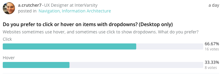
See the results of a poll on BetterDesign, where the click behaviour won.
Also see 4 reasons why hover menus are problematic.
False positives
Hover actions fire every time the mouse pointer is over a menu. But very often, the user does not do this intentionally. The hover area just happens to be along the path the user wants the mouse to go. A mega menu would obstruct the rest of the page from view, forcing the user to find a spot outside the menu to make it disappear and resume their activities.
False negatives
If the user moves their pointer 1 pixel too far outside the hover item, the item will collapse in. This is not so much an issue for a mega-menu, which has a large hover area when open. But some hover menus are less forgiving. They frustrate the user with sub-sub-menus, and, if the user misses the trajectory from menu to sub-menu, the hover interaction forces them to start again.
Non-stickyness
The hover state only persists as long as the mouse is over the object. Please note that any user action with a mouse while in hover is not possible.
Hover actions are great for very light interactions, such a button ripple effect, or an animation. For more complex interactions – such as revealing hidden navigation and click options (where the user needs to read, and pause and think) – go with click.
Example (CSS-only)
The HTML code is a simple ul/li list, as this is what is also generated by WordPress menus:
<nav>
    <ul>
        <li><a href="#">Link #1 +</a>
            <ul>
                <li><a href="#">Submenu Item #1</a></li>
                <li><a href="#">Submenu Item #2</a></li>
                <li><a href="#">Submenu Item #3</a></li>
                <li><a href="#">Submenu Item #4</a></li>
                <li><a href="#">Submenu Item #5</a></li>
            </ul>
        </li>

        <li><a href="#">Link #2 +</a>
            <ul>
                <li><a href="#">Submenu Item #1</a></li>
                <li><a href="#">Submenu Item #2</a></li>
                <li><a href="#">Submenu Item #3</a></li>
            </ul>
        </li>

        <li><a href="#">Link #3</a></li>
        <li><a href="#">Link #4</a></li>
        <li><a href="#">Link #5</a></li>
    </ul>
</nav>
The CSS is using :active and :focus states.
:focus and :active are two different states.
:focusrepresents the state when the element is currently selected to receive input and:activerepresents the state when the element is currently being activated by the user.
:root {
    --link-color: #ecf0f1;
    --link-active-color: #f1c40f;
}

nav ul {
    list-style: none;
    padding-left: 0;
}

nav ul li {
    display: inline-block;
    text-align: left;
}

nav a {
    display: block;
    padding: 0 16px;
    transition: color 0.2s;
    color: var(--link-color);
    font-size: 18px;
    line-height: 2;
    text-decoration: none;
}

nav ul ul li a {
    color: var(--link-color);
}
nav ul ul li a:focus,
nav ul ul li a:active {
    color: var(--link-active-color);
}
nav a:hover,
nav a:focus,
nav a:active,
nav a:focus:hover,
nav a:active:hover {
    color: var(--link-active-color);
}

nav ul ul {
    display: none;
    position: absolute;
    background: #2d3436;
    padding: 8px 0 8px 0;
    box-shadow: rgba(0, 0, 0, 0.25) 0px 50px 100px -20px, rgba(0, 0, 0, 0.3) 0px 30px 60px -30px;
}
nav ul ul li {
    display: list-item;
    position: relative;
}

nav ul li:focus > ul,
nav ul li:active > ul {
    display: inherit;
}

nav a:focus + ul,
nav a:active + ul {
    display: inherit;
}
Demo
See the Pen Clicky Menu (CSS-only) by Ciprian (@ciprian) on CodePen.
