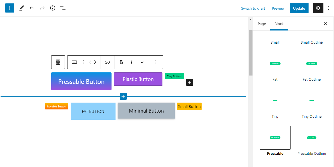
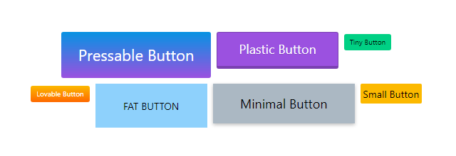
One of the shortcomings of the WordPress default button blocks is the size variation. There is none. Sometimes the buttons are too large for some situations and sometimes they lack padding and typography controls. While the typography controls are coming pretty soon, buttons can be extended easily.
Following the Gutenberg Handbook, I have created a small plugin – and accompanying code samples – to create addtional button sizes/options without relying on another block plugin.
buttons.js
The following code will register several new blocks, allowing them to be selected under the Button Block’s Styles accordion.
// Tiny Button
wp.blocks.registerBlockStyle('core/button', {
    name: 'tiny-button',
    label: 'Tiny'
});
wp.blocks.registerBlockStyle('core/button', {
    name: 'tiny-outline-button',
    label: 'Tiny Outline'
});


// Pressable Button
wp.blocks.registerBlockStyle('core/button', {
    name: 'pressable-button',
    label: 'Pressable'
});
wp.blocks.registerBlockStyle('core/button', {
    name: 'pressable-outline-button',
    label: 'Pressable Outline'
});


// Plastic Button
wp.blocks.registerBlockStyle('core/button', {
    name: 'plastic-button',
    label: 'Plastic'
});
wp.blocks.registerBlockStyle('core/button', {
    name: 'plastic-outline-button',
    label: 'Plastic Outline'
});


// Minimal Button
wp.blocks.registerBlockStyle('core/button', {
    name: 'minimal-button',
    label: 'Minimal'
});
wp.blocks.registerBlockStyle('core/button', {
    name: 'minimal-outline-button',
    label: 'Minimal Outline'
});


// Small Button
wp.blocks.registerBlockStyle('core/button', {
    name: 'small-button',
    label: 'Small'
});
wp.blocks.registerBlockStyle('core/button', {
    name: 'small-outline-button',
    label: 'Small Outline'
});
buttons.css
The buttons.css file is enqueued to load for both areas, the back-end (the editor) and the front-end. See sample styles for the buttons below, including the regular and the outline version of the buttons. I mostly play with the font size and the padding, however more visual effects can be added, such as borders, clipped corners, hover effects, transitions and more.
.is-style-small-button .wp-block-button__link,
.wp-block-button.is-style-small-button .wp-block-button__link,
.is-style-small-outline-button .wp-block-button__link,
.wp-block-button.is-style-small-outline-button .wp-block-button__link {
    font-size: 12px;
    padding: 4px 8px;
}


.is-style-tiny-button .wp-block-button__link,
.wp-block-button.is-style-tiny-button .wp-block-button__link,
.is-style-tiny-outline-button .wp-block-button__link,
.wp-block-button.is-style-tiny-outline-button .wp-block-button__link {
    font-size: 10px;
    padding: 4px 8px;
}


.is-style-pressable-button .wp-block-button__link,
.wp-block-button.is-style-pressable-button .wp-block-button__link,
.is-style-tiny-pressable-button .wp-block-button__link,
.wp-block-button.is-style-tiny-pressable-button .wp-block-button__link {
    padding: 16px 24px;
    font-size: 22px;
    text-decoration: none;
    color: #fff;
    position: relative;
    display: inline-block;
}


.is-style-pressable-button .wp-block-button__link:active,
.wp-block-button.is-style-pressable-button .wp-block-button__link:active,
.is-style-tiny-pressable-button .wp-block-button__link:active,
.wp-block-button.is-style-tiny-pressable-button .wp-block-button__link:active {
    transform: translate(0px, 5px);
    box-shadow: 0px 1px 0px 0px;
}


.is-style-plastic-button .wp-block-button__link,
.wp-block-button.is-style-plastic-button .wp-block-button__link,
.is-style-tiny-plastic-button .wp-block-button__link,
.wp-block-button.is-style-tiny-plastic-button .wp-block-button__link {
    text-decoration: none;
    padding: 10px 30px;
    display: inline-block;
    position: relative;
    border: 1px solid rgba(0,0,0,0.21);
    border-bottom: 4px solid rgba(0,0,0,0.21);
    border-radius: 4px;
    text-shadow: 0 1px 0 rgb(0 0 0 / 15%);
}


.is-style-minimal-button .wp-block-button__link,
.wp-block-button.is-style-minimal-button .wp-block-button__link,
.is-style-tiny-minimal-button .wp-block-button__link,
.wp-block-button.is-style-tiny-minimal-button .wp-block-button__link {
    padding: 1.2rem 2.4rem;
    line-height: 1;
    box-shadow: 0 2px 5px 0 rgb(0 0 0 / 26%);
    -webkit-tap-highlight-color: rgba(0,0,0,0);
    -webkit-user-select: none;
    -moz-user-select: none;
    -ms-user-select: none;
    user-select: none;
    transition: all 0.5s cubic-bezier(0.23, 1, 0.32, 1);
    font-size: 15px;
}
functions.php
(or your custom functionality plugin)
/**
 * Extend Gutenberg Buttons
 */

// Enqueue JS/CSS for the buttons block (front-end)
function mdlui_enqueue() {
    wp_enqueue_script('mdlui-buttons', plugins_url('/blocks/buttons.js', __FILE__), ['wp-blocks'], MDLUI_VERSION, true);
    wp_enqueue_style('mdlui-buttons', plugins_url('/assets/css/style.css', __FILE__), [], MDLUI_VERSION);
}

add_action('enqueue_block_assets', 'mdlui_enqueue');

// Enqueue block styles for editor (back-end)
function mdlui_editor_enqueue() {
    wp_enqueue_style('mdlui-buttons', plugins_url('/assets/css/style.css', __FILE__));
}

add_action('enqueue_block_editor_assets', 'mdlui_editor_enqueue');
See how easy it is to add more button styles? Even with typography controls, I still want more control over borders, shadows and most importantly hover effects.
Before having this option, I was using my own button library – Thin UI – which I’ll convert to button styles in one of my upcoming WordPress plugins, Modern Design Library UI.
