How to identify and update your underperforming pages using the Content Report
If you’ve ever wondered which pages on your site are catching attention right now — and which ones need love — the new Active Analytics Content Report has your back. It shows every page’s views over the last 30 days, highlights trends, and gives you quick, visual mini‑charts so you can spot patterns in seconds.
What you’ll see
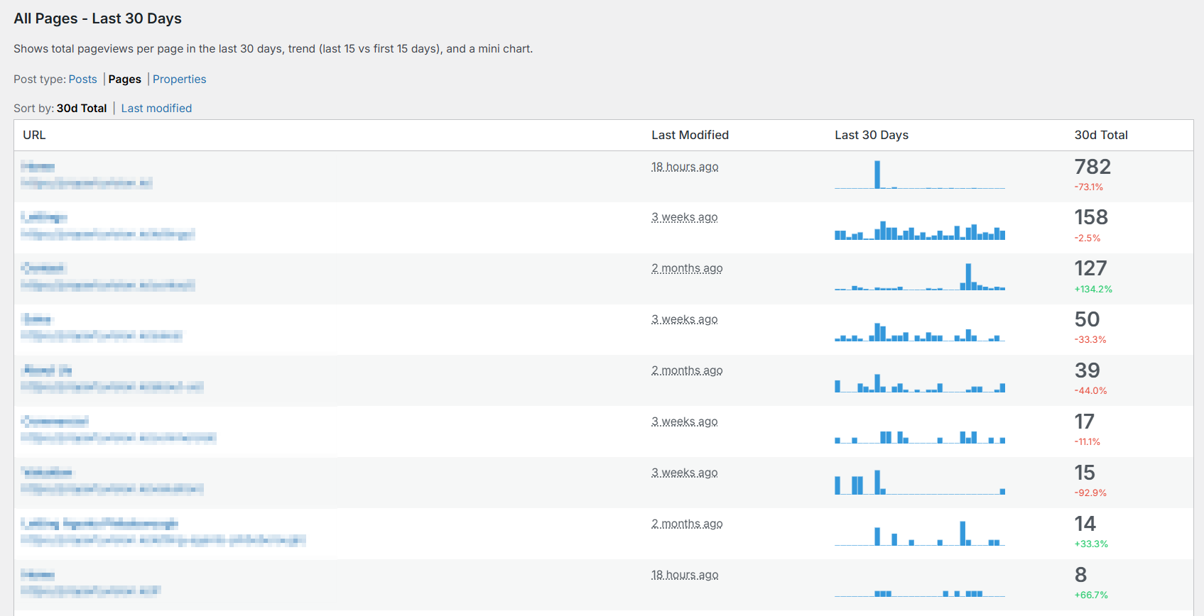
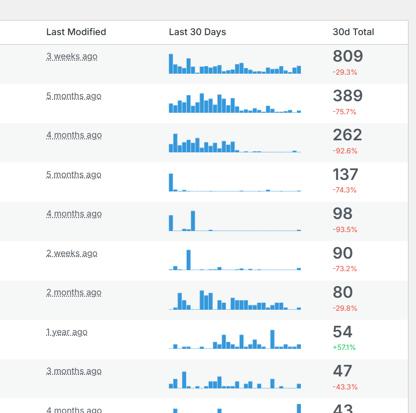
- All Pages – Last 30 Days: A single table of your content with the essentials:
- URL and Title: Click to open the page in a new tab.
- Last Modified: How recently you updated the page.
- Last 30 Days: A tiny “sparkline” chart for each page (more on that below).
- 30d Total: The total views in the last month, plus a colored trend: green for growth, red for decline.
- Filter by post type: Switch between pages, posts, products (and other public types your site uses) with one click. This keeps the report focused on what you care about.
- Sort your way:
- 30d Total: See your top performers first.
- Last modified: Review recently updated pages to connect edits with results.
Active Analytics tracks this data automatically — no setup required.
Ready to switch your WordPress website to simple, privacy-first analytics?
Try Active Analytics for WordPress.
Microcharts that do the reading for you
Each row includes a mini bar chart — often called a “sparkline” — that shows the last 30 days of views for that page.
- One bar per day: Think of it as the page’s heartbeat over the past month.
- Hover for details: Move your mouse over the chart to see the exact number of views for that day.
- Crisp on any screen: The charts automatically adjust for high‑resolution displays, so they stay sharp and readable.
These microcharts make it effortless to spot:
- Rising stars: Bars trending upward across recent days.
- Fading interest: A steady decline you might want to address.
- Seasonality and spikes: Launches, promotions, or mentions that cause sudden jumps.
The trend signal (what the +/- % really means)
Next to each page’s total views, you’ll see a percentage in green (up) or red (down). This compares the last 15 days to the first 15 days of the month:
+12.5%: The page is gaining momentum.-8.0%: The page is cooling down.0.0%: Traffic is steady.
It’s a quick, reliable way to gauge whether a page is trending in the right direction — without getting lost in the weeds.
Why this is useful (in plain terms)
- Spot opportunities fast: See what’s working today — not last quarter.
- Protect your winners: If a top page starts slipping, you’ll catch it early.
- Tie edits to outcomes: Sort by “Last modified” to see if your updates moved the needle.
- Plan smarter: Use the patterns you see to guide your content calendar, promotions, and SEO work.
Simple ways to put it to work
- Double down on growth: Pages with green trends deserve fresh internal links, a CTA refresh, or a small promo push.
- Rescue decliners: Update headlines, improve intros, add FAQs, or refresh images on pages trending down.
- Leverage spikes: If a page spiked, figure out why (email, social, referral) and repeat what worked.
- Mind your money pages: Filter to your product or key landing pages and keep a weekly eye on them.
Light peek under the hood (no tech skills needed)
The report automatically counts views for each page daily and turns that into a simple, readable picture. It shows:
- Your last 30 days of pageviews, day by day.
- A trend comparing the most recent half of the month to the first half.
- Clean, compact microcharts that make patterns obvious at a glance.
No setup or spreadsheets required — just visit the Content tab and start scanning.
Quick tips
- Hover any mini chart to see exact daily numbers.
- Click a page’s title or URL to open it in a new tab for a quick update.
- Filter to the content type you care about (e.g., Pages vs. Posts).
- Sort by “Last modified” to review your latest edits’ performance.
- Worry less about “big reports.” This one is designed for action: scan, spot, act.
In a few seconds, you’ll know what’s working, what’s not, and what to do next.
Active Analytics tracks this data automatically — no setup required.
Ready to switch your WordPress website to simple, privacy-first analytics?
Try Active Analytics for WordPress.