This is something I’ve always wanted to add to my theme, but I was afraid of the impact on the Core Web Vitals. As you scroll down, specific elements fade and slide into view. The more discrete, the better.
Without further ado, here’s the (vanilla) JavaScript you need to add. It’s based on the IntersectionObserver API, and it only works in modern browsers.
No IE 11 or Legacy Edge for you, and perhaps no Opera or older Safari.
First, we check if at least one element exists. Then we set some options and decide on the threshold (the percentage of the target element which is visible). Then, we check if the element is visible — according to the parameters set in options — then add a .is-changed class to the element, otherwise, remove it.
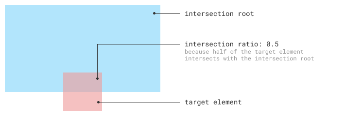
To better understand the threshold and rootMargin check out below visualization demo created by Michelle Barker. The dotted black border specifies the rootMargin and the two light colour boxes at top and bottom specify the threshold value. As you scroll the page, which elements are in view will be displayed in the left section.
See the Pen IntersectionObserver Visualizer by Michelle Barker (@michellebarker) on CodePen.
🖱️ Here’s another tutorial on how to use the IntersectionObserver API to mark current scroll progress.
Keeping the .is-changed class will trigger the animation once. If you scroll back up and then down again, the animation won’t be triggered. If you want it to be triggered again, although I find it a bit confusing and uneasy to the eye — uncomment the line below in the else block:
entry.target.classList.remove('is-changed');and comment the line below:
observer.unobserve(entry.target);The JavaScript
document.addEventListener('DOMContentLoaded', () => {
    /**
     * Observe and animate all elements having a class of .saturn-anim-in
     */
    if (document.querySelector('.saturn-anim-in')) {
        const options = {
            root: null, // use the document's viewport as the container
            rootMargin: '0px', // % or px - offsets added to each side of the intersection
            threshold: 0.5 // percentage of the target element which is visible
        }

        let callback = (entries) => {
            entries.forEach(entry => {
                if (entry.isIntersecting) {
                    entry.target.classList.add('is-changed');
                    observer.unobserve(entry.target);
                } else {
                    //entry.target.classList.remove('is-changed');
                }
            });
        }

        // Create the intersection observer instance by calling its constructor and passing it a
        // callback function to be run whenever a threshold is crossed in one direction or the other:
        let observer = new IntersectionObserver(callback, options);

        document.querySelectorAll('.saturn-anim-in').forEach(box => { observer.observe(box) });
    }
}, false);
The CSS
Then we have the CSS. Note that you can add any effect you want, even multiple effects:
.saturn-anim-in {
    transform: translateY(4rem) translateZ(0);
    transition: transform cubic-bezier(0.19, 1, 0.22, 1) 2s, opacity cubic-bezier(0.19, 1, 0.22, 1) 2s;
    opacity: 0.5;
}
.saturn-anim-in.is-changed {
    transform: translateY(0rem) translateZ(0);
    opacity: 1;
}
A nice improvement here would be to fade and slide in the paragraphs, and fade and slide from the left the headings. Also, fade the images. Basically, add more classes, such as .saturn-anim-left or .saturn-fade-in and then reference them in the code:
document.querySelectorAll('.saturn-anim-in').forEach(box => { observer.observe(box) });
document.querySelectorAll('.saturn-anim-left').forEach(box => { observer.observe(box) });
document.querySelectorAll('.saturn-fade-in').forEach(box => { observer.observe(box) });
This depends on the page structure, though, and the amount of animation and movement it adds. It’s very subjective.
