Part of the CSS-Only Techniques guide.
“Times New Roman” as a Classic Web Font Option With Historical Ligatures
A ligature is a special character that combines two (or sometimes three) characters into a single character. A standard ligature is functional in nature, and is created to solve the problem of characters that crash when set next to each other.
The most common standard ligatures are the “f”-ligatures: “fi,” “fl” and sometimes “ff,” “ffi,” “ffl,” and occasionally more. These are created to prevent the unattractive collision that occurs in some typefaces between the hook and/or crossbar of the “f” and the dot or serif of the “i,” or the ascender of the “l” or second “f.”
A discretionary ligature is more decorative in nature than a standard ligature and should be used at your discretion, as the name indicates. Some discretionary ligatures combine frequently occurring letter pairs (like “Th”) into a single, graceful design.
Times New Roman has been abandoned as a modern web font, although it has been heavily used decades ago. It’s still a newspaper font, but it’s slowly being retired.
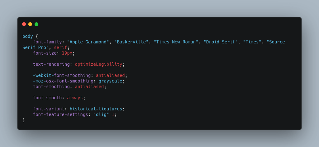
Here’s a modern Times font stack with updated historical ligatures. The most important thing here is this CSS property:
font-feature-settings: "dlig" 1;And this is because, in Windows 10 1803+, Times New Roman has been updated to version 7.00, and some (more) ligatures have been added (but into the dlig lookup, rather than the more widely-used liga). We can then use the CSS font-feature-settings to turn on this feature.
Demo
This is a hero heading with discretionary/historical ligatures: fi fj fl ff ffi ffj ffl tf ft Th, tu, ½, ⅛ —
This is a main heading with discretionary/historical ligatures: fi fj fl ff ffi ffj ffl tf ft Th, tu, ½, ⅛ —
This is a secondary heading with discretionary/historical ligatures: fi fj fl ff ffi ffj ffl tf ft Th, tu, ½, ⅛ —
Times New Roman
Times New Roman gets its name from the Times of London, the British newspaper.
In 1929, the Times hired typographer Stanley Morison to create a new text font. Morison led the project, supervising Victor Lardent, an advertising artist for the Times, who drew the letterforms.
0123456789
Because it was used in a daily newspaper, the new font quickly became popular among printers of the day. In the decades since, typesetting devices have evolved, but Times New Roman has always been one of the first fonts available for each new device (including personal computers). This, in turn, has only increased its reach.
Objectively, there’s nothing wrong with Times New Roman. It was designed for a newspaper, so it’s a bit narrower than most text fonts—especially the bold style. (Newspapers prefer narrow fonts because they fit more text per line.) The italic is mediocre. But those aren’t fatal flaws. Times New Roman is a workhorse font that’s been successful for a reason.
CSS Font Stack
.font--times-new-roman {
    font-family: "Times New Roman", "Times", serif;

    -webkit-font-smoothing: antialiased;
    -moz-osx-font-smoothing: grayscale;
    font-smoothing: antialiased;
    text-rendering: optimizeLegibility;
    font-smooth: always;
    font-variant: historical-ligatures;

    font-feature-settings: "hlig" 1, "dlig" 1, "onum" 1, "zero" 1, "swsh" 1, "kern" 1, "medi" 1;

    line-height: 1.5;
    letter-spacing: -0.004em;
    color: #323648;
}

.font--times-new-roman--small-caps {
    font-variant: all-small-caps;
    font-style: normal;
    letter-spacing: 0.08em;
}
Are you going to switch to the Times New Roman font stack for your new website project?