Part of the CSS-Only Techniques guide.
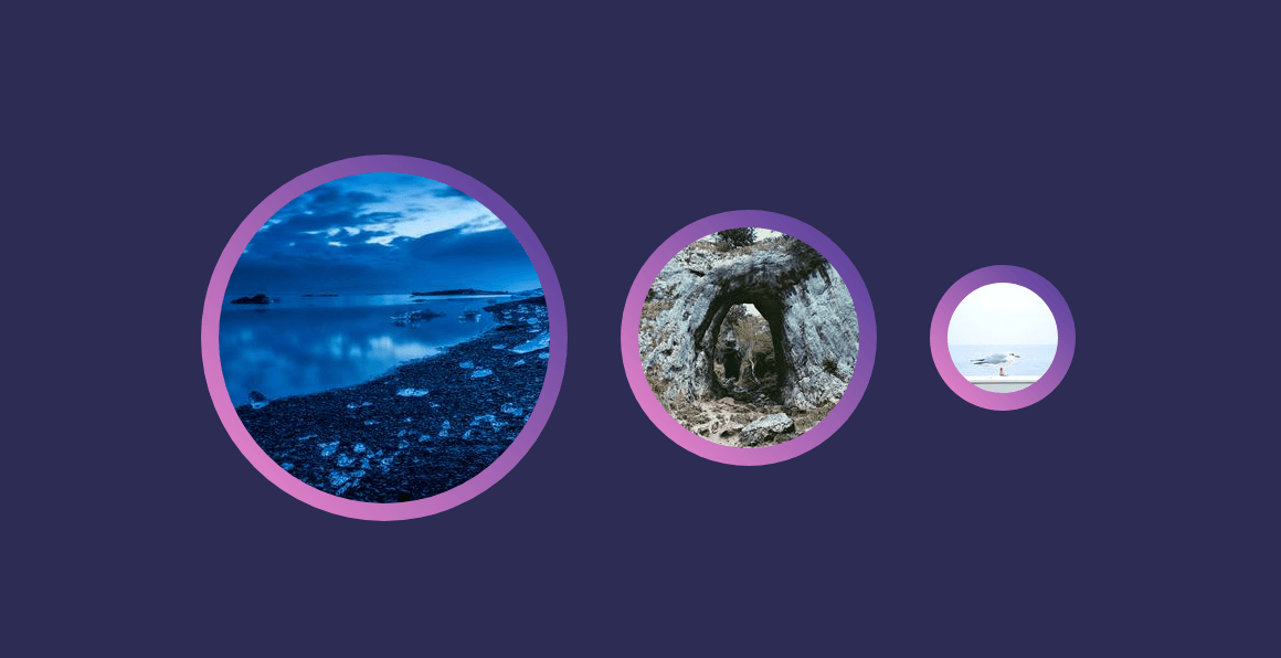
I had a visually heavy project recently and I had to create a gradient border for certain elements. In my case, images had to have a gradient border and several transformations.
I have created a simpler use-case scenario on Codepen. It’s a mix of a linear gradient background, padding and border radius:
The padding property is the actual border width. The larger the value, the more visible the gradient is.
The border radius is mere preference, but you can have slightly rounded corners or even sharp corners.
The background is a linear gradient, and, by adding a large box shadow, I highlighted the gradient even more.
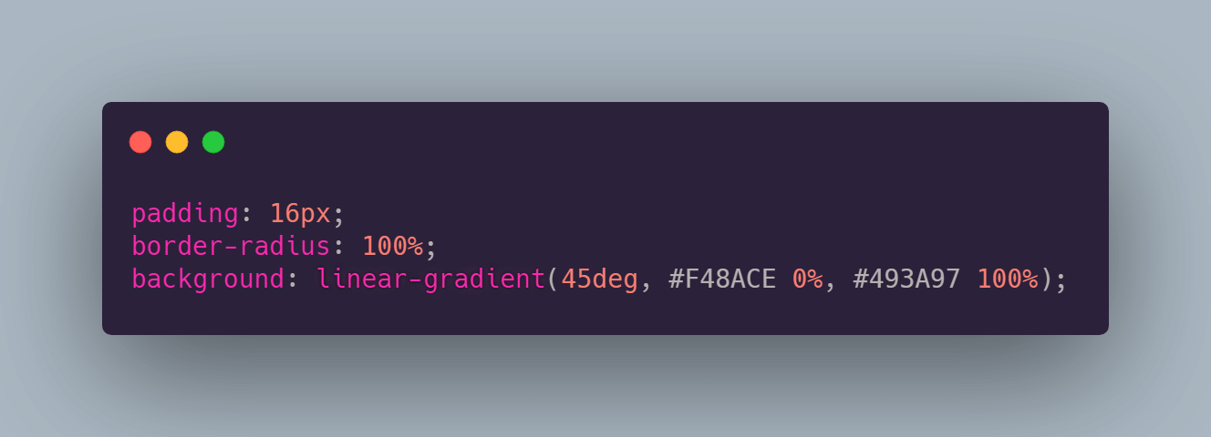
Here is the entire CSS code:
.rounded-corners-gradient-borders {
    box-sizing: border-box;
    padding: 16px;
    border-radius: 100%;
    background: linear-gradient(45deg, #F48ACE 0%, #493A97 100%);

    margin: 24px;
    transition: transform 0.6s cubic-bezier(0.76, 0, 0.24, 1), box-shadow 0.8s cubic-bezier(0.76, 0, 0.24, 1);
}

.rounded-corners-gradient-borders:hover {
    transform: scale(1.1) rotate(1deg);
    transform-origin: center center;
    box-shadow: inset 0 0 10px rgba(0, 0, 0, 0.25), 0 0 48px rgba(0, 0, 0, 0.35);
}
Enjoy!
Previous article
