Table of Contents

What is FX Builder?
FX Builder is a simple, but powerful page builder plugin designed specifically for ClassicPress, offering users a streamlined way to create visual columns directly in the post editor. Unlike many other page builders, FX Builder does not rely on shortcodes, ensuring that the editing experience remains clean and straightforward.
One of the standout features of FX Builder is its simplicity. The plugin is incredibly easy to use, allowing users to create between one and five visual columns with minimal effort. Whether you’re a beginner or an experienced ClassicPress user, FX Builder seamlessly integrates into the post editor, providing an enhanced, visually-driven editing experience.
Another key advantage of FX Builder is its non-intrusive nature. If at any point you decide to disable the plugin, none of your content will be lost. This feature ensures that your content remains intact and unaffected by the plugin’s removal. As an open-source solution, FX Builder is available under the GPL v3.0 license, making it a free and community-driven tool that encourages collaboration and innovation.
Thoughts on page builders
ClassicPress uses the classic editor, which is based on TinyMCE. After spending several years working with the block editor in WordPress, transitioning back to ClassicPress can reveal some missing layout options. As a back-end developer, I find it easy to add inline styles, custom classes (defined in my theme), or HTML elements through the text/code tab in the editor.
However, the one visual feature I miss is the ability to create column layouts. I don’t need many of the other blocks offered by WordPress — such as cover blocks, image blocks, or media & text blocks. FX Builder addresses this gap by offering columns, and its sections function like groups. These sections can be styled with custom classes and adjusted for full-width or content-width layouts.
That’s where FX Builder really shines (personal opinion 😊). It provides a simple, seamless way to add sections and columns while enhancing typography controls. Everything else — such as paragraphs, headings, images, code, and quotes — remains native to TinyMCE, preserving the familiar editing experience.
How do you actually build a page?
Let’s get started.
Once the FX Builder plugin is installed, a new tab appears on your page (or post) editor.
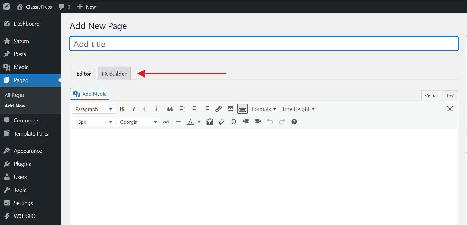
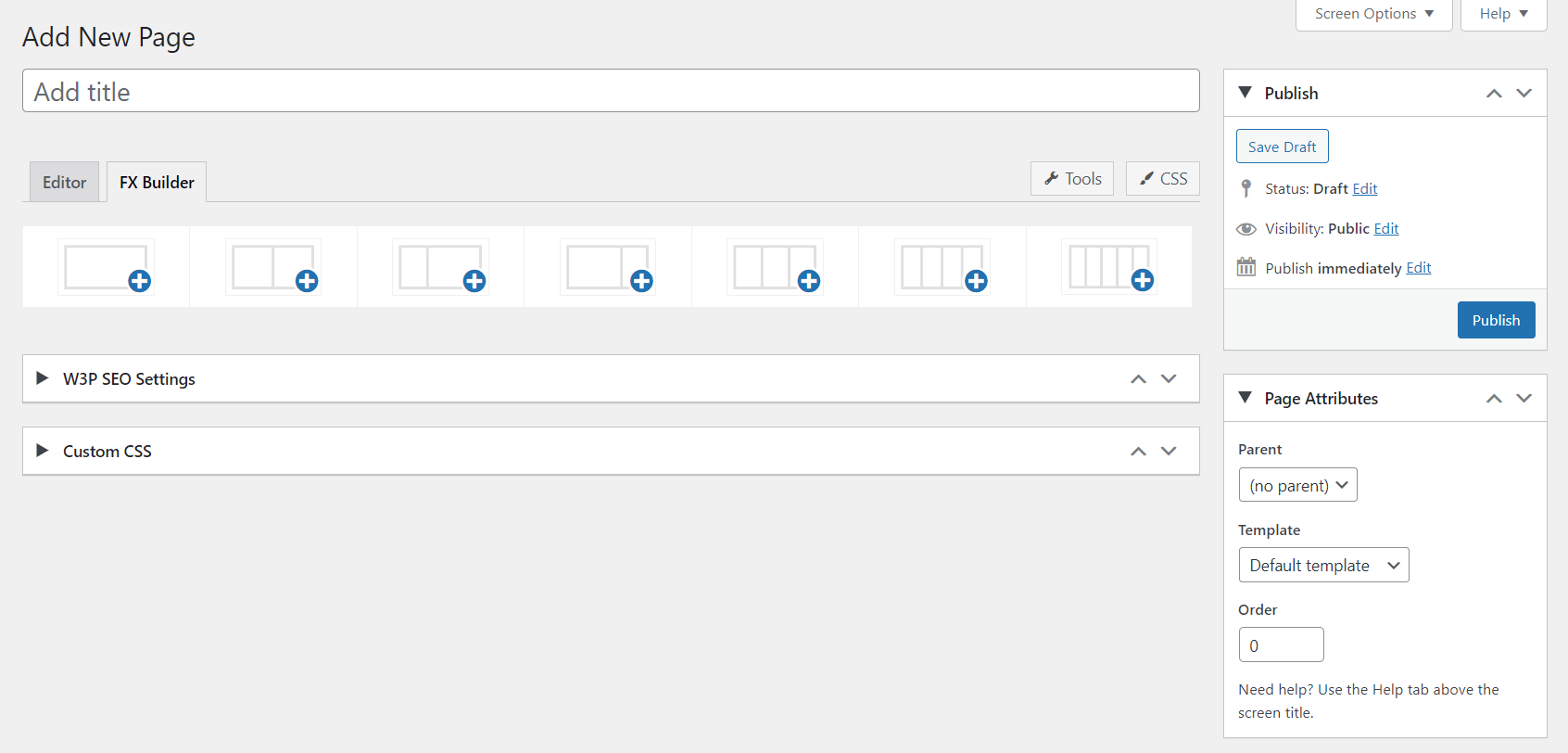
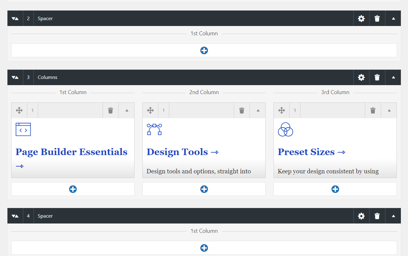
Switching to it will present the user with a column inserter. The current options are 1-column to 5-columns.
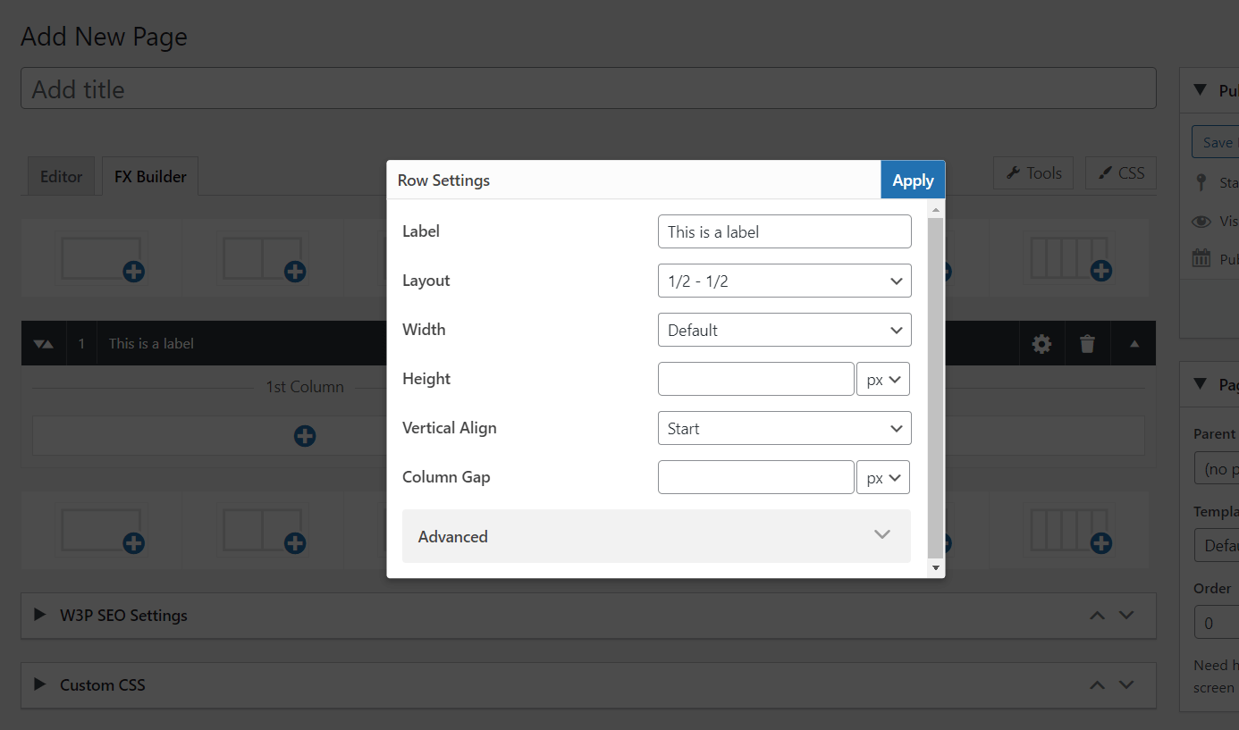
Each set of columns is grouped under a row (section). Rows can be labelled, and they can have custom width, height, vertical alignment (if more than one column), column gap (if more than one column), custom ID and additional classes. Because themes and developers have different views on design consistency, I have implemented multiple size units (px, em, rem, vw/vh, and percentage).
Using the new SortableJS library in ClassicPress, both rows and columns can be dragged and dropped to reorder.
You can add as many rows and columns as you want. Inside each column, there is a TinyMCE editor, which allows any HTML element to be added. Text content (such as headings and paragraphs) have additional typography settings, such as font family, font size, font weight, and line height.
There are also preset sizes and weights, mostly for consistency. I’d rather mark headings as “Extra Large” instead of setting them to 28px. It’s one of the things I liked in the block editor, and it really helps with building consistent designs.
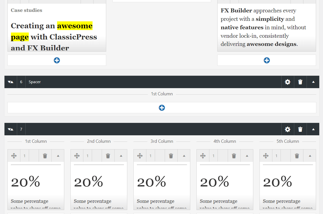
That is all! Everything else is limited by your imagination.
Demo
If you want to see how the columns look like on the front-end, see these 2 demo pages:


