WordPress comes with a set of native blocks that should be enough for every designer. However, if you are a theme designer or a WordPress plugin developer, you can produce various styles for each block. This will reduce the amount of custom CSS a front-end developer needs to add.
If an existing WordPress block doesn’t fully meet your needs, it can be tempting to build a new one from scratch. Doing so gives you complete control over the block and what your users will see. Custom blocks are always an option, but it’s usually better to try extending existing blocks before building your own. I’ve been there.
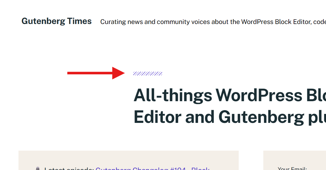
Let’s take, for example, separators. They come in 3 varieties, short, long and dotted. I do like, however, striped backgrounds, or dotted backgrounds, and I would like to have a short strip above my titles. Something like the below:
I would also like to have a wider range of buttons, because the default ones (filled and outline) will quickly saturate my designs.
WordPress Block Extends
Let’s build a few block styles, also called block extends.
First, we enqueue the scripts and styles, both for the front-end and the back-end. Note how my theme below extends a few native blocks.
function whiskey_block_extends() {
    wp_enqueue_script(
        'whiskey-extend-cover-block',
        get_stylesheet_directory_uri() . '/block-extends/extend-cover-block.js',
        [ 'wp-blocks' ]
    );

    wp_enqueue_script(
        'whiskey-extend-columns-block',
        get_stylesheet_directory_uri() . '/block-extends/extend-columns-block.js',
        [ 'wp-blocks' ]
    );

    wp_enqueue_script(
        'whiskey-extend-media-text-block',
        get_stylesheet_directory_uri() . '/block-extends/extend-media-text-block.js',
        [ 'wp-blocks' ]
    );

    wp_enqueue_script(
        'whiskey-extend-details-block',
        get_stylesheet_directory_uri() . '/block-extends/extend-details-block.js',
        [ 'wp-blocks' ]
    );

    wp_enqueue_script(
        'whiskey-extend-button-block',
        get_stylesheet_directory_uri() . '/block-extends/extend-button-block.js',
        [ 'wp-blocks' ]
    );
}

add_action( 'enqueue_block_editor_assets', 'whiskey_block_extends' );

function whiskey_block_extends_styles() {
    wp_enqueue_style(
        'whiskey-extend-cover-block-style',
        get_stylesheet_directory_uri() . '/block-extends/extend-cover-block.css'
    );

    wp_enqueue_style(
        'whiskey-extend-cover-columns-style',
        get_stylesheet_directory_uri() . '/block-extends/extend-columns-block.css'
    );

    wp_enqueue_style(
        'whiskey-extend-cover-media-text-style',
        get_stylesheet_directory_uri() . '/block-extends/extend-media-text-block.css'
    );

    wp_enqueue_style(
        'whiskey-extend-details-style',
        get_stylesheet_directory_uri() . '/block-extends/extend-details-block.css'
    );

    wp_enqueue_style(
        'whiskey-extend-button-style',
        get_stylesheet_directory_uri() . '/block-extends/extend-button-block.css'
    );
}

add_action( 'enqueue_block_assets', 'whiskey_block_extends_styles' );
Next, each JavaScript file will register a new style, or a new variation.
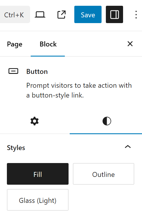
Button Block Extends
For example, I really wanted a glassy look for my buttons. You can easily achieve this by using background transparency and backdrop blur. But I wanted to have this available for my front-end developers, using a single click.
extend-button-block.js
(function (blocks) {
    blocks.registerBlockStyle("core/button", {
        name: "glass-light",
        label: "Glass (Light)",
    });
})(window.wp.blocks);
That is all! Really.
Now we need to style the button.
extend-button-block.css
.wp-block-button.is-style-glass-light .wp-block-button__link.wp-element-button {
    background-color: rgba(255, 255, 255, .25);
    backdrop-filter: blur(6px);

    transition: background-color .3s cubic-bezier(0.25, 1, 0.5, 1);
}
.wp-block-button.is-style-glass-light .wp-block-button__link.wp-element-button:hover {
    background-color: rgba(255, 255, 255, .35);
}
And now I have a glassy button, visible in both front-end and back-end.
Using the code above, I can register as many extends (variations, styles) as I want.
Cover Block Extends
Let’s take the Cover block. For this block, I wanted to add an Elementor-like effect, which blurs the image as the user scrolls down. There might be some JavaScript involved, and we want to do this in a standardized way. Let’s register our Cover style (or styles, as I have 4).
extend-cover-block.js
(function (blocks) {
    blocks.registerBlockStyle("core/cover", {
        name: "hover-reveal",
        label: "Hover Reveal",
    });

    blocks.registerBlockStyle("core/cover", {
        name: "slide-reveal",
        label: "Slide Reveal",
    });

    blocks.registerBlockStyle('core/cover', {
        name: 'parallax',
        label: 'Parallax',
    });

    blocks.registerBlockStyle('core/cover', {
        name: 'scrollfade',
        label: 'ScrollFade',
    });
})(window.wp.blocks);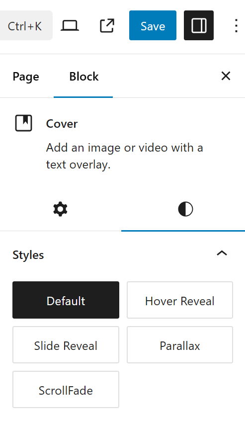
The names are pretty much self-explanatory.
And here are the styles.
extend-cover-block.css
.wp-block-cover.is-style-hover-reveal:not(.has-parallax) {
	background-size: contain;
	background-repeat: no-repeat;
}

.wp-block-cover.is-style-hover-reveal a:hover,
.wp-block-cover.is-style-hover-reveal a:active {
	color: currentColor;
	text-decoration: underline;
}

.wp-block-cover.is-style-hover-reveal .wp-block-cover__inner-container {
	opacity: 0;
	-webkit-transition: opacity 0.2s ease-in-out;
	-moz-transition: opacity 0.2s ease-in-out;
	transition: opacity 0.2s ease-in-out;
}

.wp-block-cover.is-style-hover-reveal:hover .wp-block-cover__inner-container {
	opacity: 1;
}

.wp-block-cover.is-style-slide-reveal .wp-block-cover__background,
.wp-block-cover.is-style-slide-reveal .wp-block-cover__inner-container {
    transform: translateX(120%);
    transition: transform 0.6s cubic-bezier(0.16, 1, 0.3, 1);
}
.wp-block-cover.is-style-slide-reveal:hover .wp-block-cover__background,
.wp-block-cover.is-style-slide-reveal:hover .wp-block-cover__inner-container {
    transform: translateX(0);
}
The variation I was talking about earlier, the ScrollFade, has its styles in my theme’s JavaScript file, so it’s loaded on start-up, along with all my other theme’s scripts.
/**
 * Whiskey Cover (Parallax)
 */
if (document.querySelector('.is-style-parallax .wp-block-cover__image-background')) {
    let lFollowX = 0,
        lFollowY = 0,
        x = 0,
        y = 0,
        friction = 1 / 30;

    function moveBackground() {
        x += (lFollowX - x) * friction;
        y += (lFollowY - y) * friction;

        let translate = `translate(${x}px, ${y}px) scale(1.1)`;

        const elements = document.querySelectorAll('.is-style-parallax .wp-block-cover__image-background');
        elements.forEach(element => {
            element.style.transform = translate;
        });

        window.requestAnimationFrame(moveBackground);
    }

    window.addEventListener('mousemove', (e) => {
        let lMouseX = Math.max(-100, Math.min(100, window.innerWidth / 2 - e.clientX));
        let lMouseY = Math.max(-100, Math.min(100, window.innerHeight / 2 - e.clientY));
        lFollowX = (20 * lMouseX) / 100;
        lFollowY = (10 * lMouseY) / 100;
    });

    moveBackground();
}


/**
 * Whiskey Cover (ScrollFade)
 */
if (document.querySelector('.is-style-scrollfade .wp-block-cover__image-background')) {
    const elements = document.querySelectorAll('.is-style-scrollfade .wp-block-cover__image-background');

    window.addEventListener('scroll', () => {
        const fromTop = window.scrollY;

        elements.forEach(element => {
            const blurValue = `blur(${(fromTop / 50)}px)`;
            const saturateValue = `saturate(${1 - ((fromTop / document.documentElement.scrollHeight) * 10)})`;
            const scaleValue = `scale(${1 + (fromTop / 10000)})`;

            element.style.filter = `${blurValue} ${saturateValue}`;
            element.style.opacity = 1 - ((fromTop / document.documentElement.scrollHeight) * 1.3);
            element.style.transform = scaleValue;
        });
    });
}
Now, if I’m commercially distributing a theme, I want it to provide a set of good alternatives to all native blocks. There are some plugins out there that do this and add a slew of controls to the blocks, but, in my opinion, having 10 styles for (almost) each block, would amount to a wide range of different designs.
Going back to my initial separator/divider block example, I created my own plugin, a long time ago. This plugin creates one block only with 2 controls (width and height) and the rest is block extends. I would love the styles to be shown in a dropdown, as I could squeeze dozens of them without having a long scrollable sidebar.
See this blog post if you are looking for a PHP or React way to register a block extend.
Another valid use-case for building a block extend plugin, is building a “brand plugin”. Basically, a brand plugin will contain all UI elements belonging to a specific company brand: buttons, cards, covers, separators, colours, gradients and so on.
