HTML Select Fields as beautiful as never before
tail.select is back: Create beautiful, functional and extensive (Multi) Select Fields with pure, vanilla JavaScript.
The tail.select library has been rewritten in vanilla JavaScript and ready to beautify and extend your HTML <select> fields… again! Add a search bar, multi-selection utilities (such as “Select All” or “None” buttons), a pixel-perfect design and many more user-friendly functions to your website.
Table of Contents
tail.select — Beautify Select Fields
Replace and improve your HTML <select> fields with style with nothing but Vanilla JavaScript!
A few notable features:
- Beautiful (Multiple) Select Field
- Awesome Search function
- Move selected Options wherever you want
- Over 30 Options & 5 Themes
- Extend- and Translatable Environment
- Hackable with 3 Callbacks & 3 Events
- tail.select is back in plain vanilla JavaScript…
- …and still Free/To/Use — MIT Licensed
tail.select – In the wild
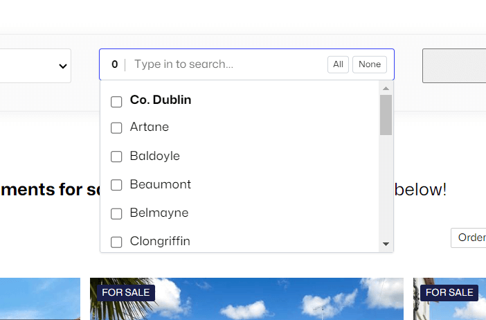
See tail.select in action on KMProperty.ie.
The search features optgroups, search (for really long lists) and quick select (All, None or each optgroup).
Enabling a dropdown is as easy as 🍦 Vanilla JavaScript –
tail.select(".select");A beautiful Select Field
The tail.select fields below shows you the absolute standard, without any settings!
Before (Single Select, without <optgroup>)
After (Single Select, without <optgroup>)
Code
<select class="tail">
    <option>[...]</option>
    <option>[...]</option>
    <option>[...]</option>
</select>

<script>
tail.select(".tail");
</script>
Before (Multiple Select, no <optgroup>)
After (Multiple Select, no <optgroup>)
Code
<select class="tail" multiple>
    <option>[...]</option>
    <option>[...]</option>
    <option>[...]</option>
</select>

<script>
tail.select(".tail");
</script>
Before (Multiple Select, with <optgroup>)
After (Multiple Select, with <optgroup>)
Options
The library comes with an initial set of options:
multiTags: false,
multiCounter: true,
theme: 'light', // light|dark
classNames: 'tail-default',
strings: {
    all: "All",
    none: "None",
    placeholder: "Select an option...",
    search: "Type in to search...",
}
Search
By default, the custom dropdown has a search field.
Descriptions
By default, adding a data-description attribute to your <select> field <option> elements, will display them in the custom tail.select dropdown.
Tags
Tags can be enabled by using the multiTags: true option.
Code
tail.select('.tail-multiple-tags', {
    multiTags: true,
});
Themes
Currently, tail.select supports 2 themes, light (default) and dark.
Custom Classes
Custom classes can be added by using the classNames parameter.
Translation
Translated strings can be added (as opposed to pre-1.x versions) directly into the caller function.
Code
tail.select('.selector', {
    multiTags: false,
    multiCounter: true,
    theme: 'light', // light|dark
    classNames: 'tail-default',
    strings: {
        all: "All",
        none: "None",
        placeholder: "Select an option...",
        search: "Type in to search...",
    }
});
Tutorials
tail.select – How to get an array of options
This demo shows how to get multiple selected options and either populate a hidden field or return them as an array in JavaScript.
See the Pen Untitled by Ciprian (@ciprian) on CodePen.
tail.select – How to add new options
This demo shows how to add new, custom options to the dropdown.
See the Pen Untitled by Ciprian (@ciprian) on CodePen.
tail.select – How to pre-populate a dropdown and pre-select options
This demo shows how to pre-populate a dropdown on page down (or on specific event) and how to select options programmatically.
See the Pen Untitled by Ciprian (@ciprian) on CodePen.
Note that tail.select requires JavaScript. Need to enable JavaScript in your browser?


