The Problem
During the past weeks, I worked on improving the performance of Thin UI, and the first candidate was JavaScript. I had some nice popovers coded for SpeedFactor, but I wasn’t happy with the performance, especially for a single element being shown or hidden. Even with vanilla JavaScript/ES6 I needed more speed.
The Solution
The solution was to remove the JavaScript and refactor the popovers in pure CSS. In order to achieve this, the :focus pseudo-element is the most appropriate one. In order to save one element, I decided to use the <button> element for the trigger and a hidden <div> for the popover content.
Here’s the before code:
The HTML:
<p>
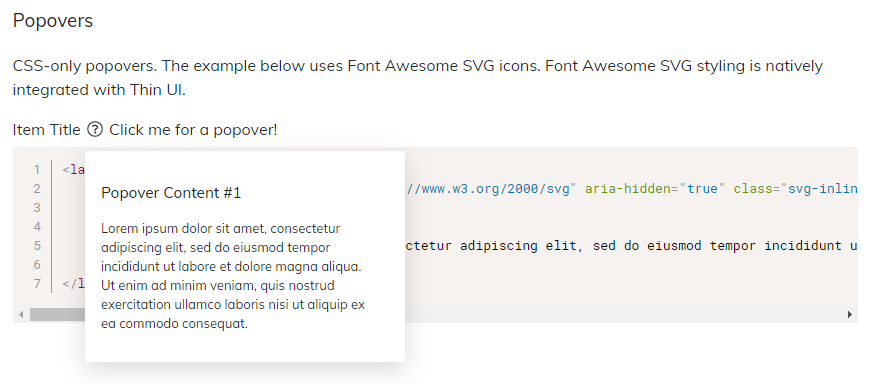
Item Title
<span data-popover-target="popover-item"><svg xmlns="http://www.w3.org/2000/svg" aria-hidden="true" class="svg-inline--fa fa-question-circle fa-w-16 fa-fw" data-icon="question-circle" data-prefix="fal" viewBox="0 0 512 512"><defs></defs><path fill="currentColor" d="M256 340a28 28 0 100 56 28 28 0 000-56zm7.7-24h-16a12 12 0 01-12-12v-.4c0-70.3 77.4-63.6 77.4-107.4 0-20-17.8-40.2-57.4-40.2-29.2 0-44.3 9.6-59.2 28.7-4 5-11 6-16.3 2.4l-13.1-9.2a12 12 0 01-2.7-17.2c21.3-27.2 46.4-44.7 91.3-44.7 52.3 0 97.4 29.8 97.4 80.2 0 67.4-77.4 63.9-77.4 107.4v.4a12 12 0 01-12 12zM256 40a216 216 0 110 432 216 216 0 010-432m0-32a248 248 0 100 496 248 248 0 000-496z"></path></svg></span>
<div class="thin-ui-popover sf-shadow-dreamy hide" data-popover="top" id="popover-item">
<button class="thin-ui-popover-close-button" aria-label="Close">
<span aria="hidden"><svg width="24" height="24" focusable="false" role="img" label="Close" style="height: 24px; max-height: 100%; max-width: 100%; overflow: hidden; vertical-align: bottom; width: 24px;"><title>Close</title><path d="M12 10.586L6.707 5.293a1 1 0 0 0-1.414 1.414L10.586 12l-5.293 5.293a1 1 0 0 0 1.414 1.414L12 13.414l5.293 5.293a1 1 0 0 0 1.414-1.414L13.414 12l5.293-5.293a1 1 0 1 0-1.414-1.414L12 10.586z" fill="currentColor" role="presentation"></path></svg></span>
</button>
<div class="thin-ui-popover-body">
<p>Lorem ipsum dolor sit amet, consectetur adipiscing elit, sed do eiusmod tempor incididunt ut labore et dolore magna aliqua. Ut enim ad minim veniam, quis nostrud exercitation ullamco laboris nisi ut aliquip ex ea commodo consequat.</p>
</div>
</div>
</p>The CSS:
[data-popover-target] {
    cursor: pointer;
}
[data-popover] {
    font-size: 13px;
    border-radius: 2px;
    padding: 16px 36px 16px 16px;
    background-color: #ffffff;
    position: absolute;
    z-index: 999;
}
[data-popover] .thin-ui-popover-body {
    position: relative;
    z-index: 1;
}
[data-popover] p {
    margin-bottom: 16px;
    color: #333333;
    font-weight: 400;
}
[data-popover] .thin-ui-popover-close-button {
    position: absolute;
    z-index: 2;
    top: 2px;
    right: 2px;
    width: 30px;
    height: 30px;
    color: #bababa;
    border: none;
    box-shadow: none;
    background: none;
    border-radius: 20px;
    padding: 0;
}
[data-popover] .thin-ui-popover-close-button:hover {
    background: #e7e7e7;
    color: #ffffff;
}

.thin-ui-popover {
    min-width: 320px;
    max-width: 480px;
}
.thin-ui-popover.hide {
    display: none !important;
}
The JavaScript:
if (document.querySelector('[data-popover-target]')) {
    // Create an array of all popover toggle buttons on the page
    let popoverButtonsArray = [].slice.call(document.querySelectorAll('[data-popover-target]'));

    // Assign toggle buttons to corosponding popover
    popoverButtonsArray.forEach((currentValue, currentIndex, listObj) => {
        let targetIdName = popoverButtonsArray[currentIndex].dataset.popoverTarget; // get the id from dataset
        let targetPopover = document.getElementById(targetIdName); // get the element based on id
        let targetCloseButton = targetPopover.querySelector('.thin-ui-popover-close-button'); // popover close icon

        // Assign all the buttons to open and close their popovers
        popoverButtonsArray[currentIndex].addEventListener('click', () => {
            // Hide other popovers
            let popoverTriggers = document.querySelectorAll('.thin-ui-popover');
            [].forEach.call(popoverTriggers, function (el) {
                el.classList.add('hide');
            });

            targetPopover.classList.toggle('hide');
        });

        // Make the close icon close the popover
        targetCloseButton.addEventListener('click', () => {
            targetPopover.classList.toggle('hide');
        });
    });
}
And here’s the after code:
The HTML:
<label class="thin-ui-popover">
    Item Title <button name="popover"><svg xmlns="http://www.w3.org/2000/svg" aria-hidden="true" class="svg-inline--fa fa-question-circle fa-w-16 fa-fw" data-icon="question-circle" data-prefix="fal" viewBox="0 0 512 512"><defs></defs><path fill="currentColor" d="M256 340a28 28 0 100 56 28 28 0 000-56zm7.7-24h-16a12 12 0 01-12-12v-.4c0-70.3 77.4-63.6 77.4-107.4 0-20-17.8-40.2-57.4-40.2-29.2 0-44.3 9.6-59.2 28.7-4 5-11 6-16.3 2.4l-13.1-9.2a12 12 0 01-2.7-17.2c21.3-27.2 46.4-44.7 91.3-44.7 52.3 0 97.4 29.8 97.4 80.2 0 67.4-77.4 63.9-77.4 107.4v.4a12 12 0 01-12 12zM256 40a216 216 0 110 432 216 216 0 010-432m0-32a248 248 0 100 496 248 248 0 000-496z"></path></svg></button>
    <div class="thin-ui-popover-body">
        <h3>Popover Content #1</h3>
        <p>Lorem ipsum dolor sit amet, consectetur adipiscing elit, sed do eiusmod tempor incididunt ut labore et dolore magna aliqua. Ut enim ad minim veniam, quis nostrud exercitation ullamco laboris nisi ut aliquip ex ea commodo consequat.</p>
    </div>
</label>
The CSS:
label.thin-ui-popover {
    position: relative;
}
label.thin-ui-popover button[name="popover"] {
    font-family: inherit;
    font-size: inherit;
    background: none;
    border: 0 none;
    display: inline;
    outline: none;
    color: inherit;
    padding: unset;
}

label.thin-ui-popover .thin-ui-popover-body {
    display: none;

    font-size: 13px;
    border-radius: 2px;
    padding: 16px 36px 16px 16px;
    background-color: #ffffff;

    box-shadow: 0 8px 24px rgba(0, 0, 0, 0.15);

    position: absolute;
    z-index: 128;
    top: 32px;
    left: 0;
    min-width: 320px;
    max-width: 480px;
}

label.thin-ui-popover button:focus + .thin-ui-popover-body {
    display: block;
}
The Advantage
The CSS-only solution eliminated the JavaScript code, the close button and a bunch of pseudo-selectors. Note that even the SVG can be changed or replaced with a text label. Or even a Unicode character such as ❓ or ❔.
And I also got rid of the Close icon, making for a better user experience.
See the Thin UI Popover Component here.
